Download PDF
Download page Contacts.
Contacts
This section covers the steps to configure and set the property values for the Contacts elements. The Contacts section in a Designer Desktop contains the following elements:
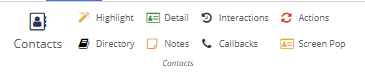
This option lists all the contact-related information of the customer in one place. An agent can access all the customer's information for each contact. An agent can create new contacts from here.
To configure and set the Contacts element on the Designer Desktop:
- On the Designer Desktop, select the page where you want to add the Contacts element. For example, the initial page where you have the Home bar and Containers configured.
- Drag and drop the Contacts element on to the canvas.
The Contacts information appear on the Designer page.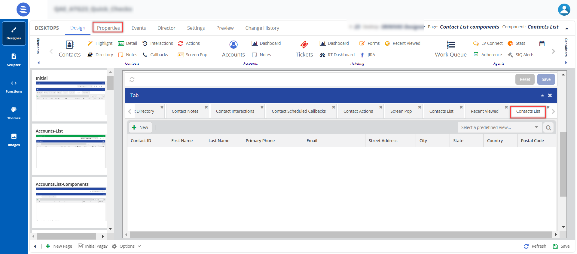

- The elements appear in a tabular form because you have selected the Container type as Tab. For more information on Containers, see Working with Containers.
- The element name of Contacts is changed to Contact List when added to the canvas. This is a system change and does not impact the functionality.
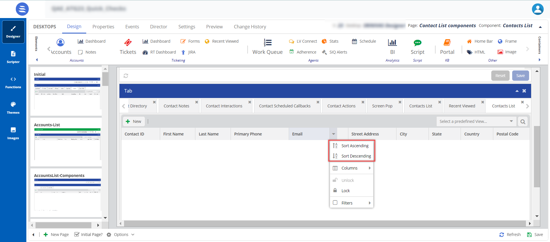
Sorting: Agents can quickly sort and search the fields from Ascending to Descending or vice versa. Agents can sort for all the available fields enabled in the Contact List. To view this option on the agent desktop, see Customizing Account, Contact, and Ticket Tables.
- Drag and drop the Contacts element on to the canvas.
- Select the Contact List element on the canvas, then click the Properties tab.
The Properties and Events tabs are enabled only when the element is selected on the canvas.
The element properties for Contacts are listed here:Number Property Available Features Closer Screenshot Expected Result 
Content Title 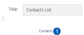
You can change the default title of an element. When you change the title, the element name on the canvas is updated to the new title. For example, you can change the title from Contacts List to List, and the name is updated on the tab on the canvas. 
Styles Header, Header Position, and Theme 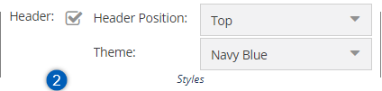
To change the current formatting, change the Header Position and Theme. When you enable the Header Position option and select the Header Position in the drop-down menu, the header position is updated. 
Screen Configuration Highlight Screen, Detail Screen, Directory Screen, and List Screen
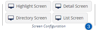
- If you want to configure the Contact List, you must configure the List Screen configuration now.
- You can handle the screen configurations of the Highlight Screen, Detail Screen, and Directory Screen individually by adding the tabs to the canvas, as explained below or you can configure everything during the Contact List configuration.
Screen Configurations for Highlight Screen, Detail Screen, and Directory Screen
You can configure the below configurations to be visible on the Contact List screen.
Screen Configuration for Highlight Screen
To configure fields in the Highlight Screen:
- Click the Highlight Screen button.
The field Field Configuration for: Highlight Screen window appears.
The configuration is mapped to the details in the Contact Groups. For more information, see Creating a Contact Group. - You can either select the configured options under the Contact Groups section or the Default or All options to choose the configuration you want the agent to view for the Highlight Screen.
- You can select fields from the Available options list and move them to the Select option.
- After updating the fields, click Save.
The changes are updated in the Highlight Screen tab and are visible on the agent desktop.
The configurations for the Detail Screen are handled the same way those for the Highlight Screen are handled.
Screen Configuration for List Screen
To configure fields in the List screen:
- Click the List Screen button.
The field Configuration for: Contact List Screen window appears. - You can select fields from the Available options list and move them to the Select option.
- After updating the fields, click Save.
The changes are updated in the Contacts List tab and are visible on the agent desktop.

Buttons New Ticket using Forms
New Account using Forms
New Contact using Forms
Custom Buttons
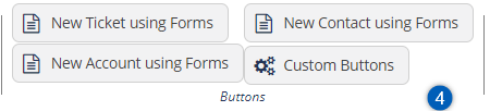
You can use these buttons to create forms for tickets, accounts, and contacts.
For more information on creating ticketing forms, see Ticketing Forms.
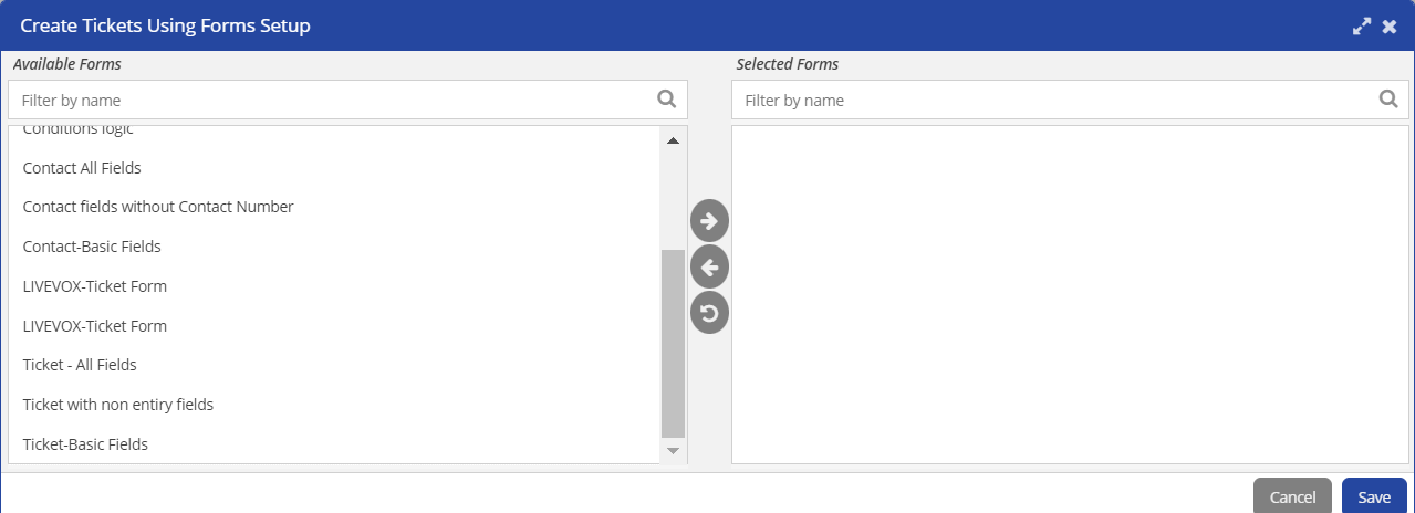
Select the forms from the Available Forms list, move them to the Selected Forms list, and Save the changes.
Custom Buttons: You can use the Custom Buttons option and create an event. For more information on creating an Event, see Events.
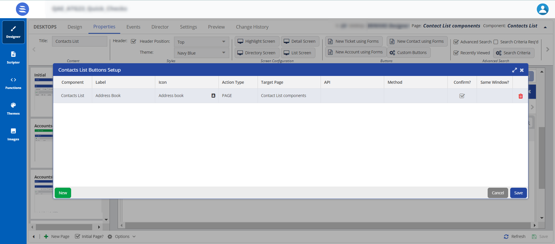
When you create a button, an event is created in the Events tab.

Advanced Search Advanced Search, Search Criteria Req'd, Recently Viewed, and Search Criteria 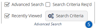
- Advanced Search and Search Criteria: Specifies if a search box, along with
 , appears for the selected elements. When you enable this feature, the Search Criteria button is enabled. By default, a set of fields is selected in the search criteria window. You can customize what fields you can search and the operators they can use..
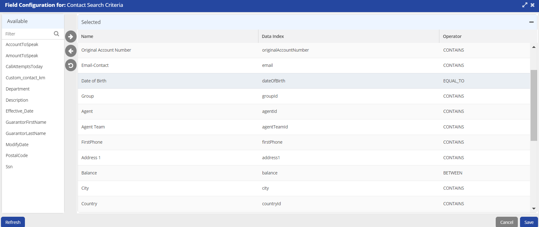
- Search Criteria Req'd: This option is disabled by default. When you enable this option, agents must search for returning the results. If it disabled, an agent will be able to view all the records in the contact manager.
- Recently Viewed: Enables you to run a search on the recently viewed records.

Interactions Allow Highlights and Configure 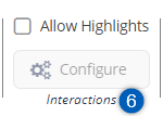
If the option is disabled, only the default options are visible to an agent. if the option is enabled, an agent can view the configured interaction highlights for the interaction types and set the result codes.

Teckst Allow Teckst and Teckst ID 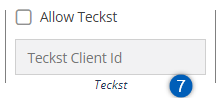
Allow Teckst: Specifies if an agent can use the Teckst platform to send SMSes.
When an agent clicks the Compose an SMS icon (
 ), the Teckst window appears.
Teckst Client ID:
- You must specify a value in this field if you have selected the Allow Teckst checkbox. To obtain the Teckst client ID, contact the Customer Care Team.
- If the Teckst platform is not enabled, an agent can still send SMSes through the default SMS window.

Options Allow Contact Creation, Allow Account Creation, Allow Contact Deletion, Allow Tickets, Allow Encrypted Fields, Allow Ticket Creation, Allow Playing Audio Recording, Allow Accounts 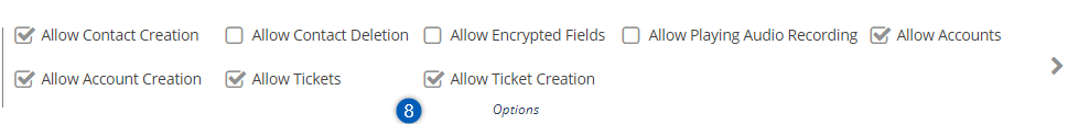
Allow Account Creation, Allow Contact Creation, Allow Account Deletion,Allow Tickets, Allow Ticket Creation,
When you enable these features, the agent can perform the tasks specified in the Options section.
By default, the Allow Account Creation, Allow Tickets, Allow Ticket Creation, Allow Contacts, and Allow Contact Creation checkboxes are enabled when creating a Designer Desktop. Administrators and managers must disable them if they do not want the agent to create them.
- After updating the required information, Save the designer desktop.
The Highlight elements allow you to configure the key components for a contact. These configured components are previewed in the Highlight area.
To configure and set the Contact Highlight element on the Designer Desktop:
- On the Designer Desktop, select a page where you want to add the Highlights element. For example, the initial page where you have the Home bar and Containers configured.
- Drag and drop the Highlight element onto the canvas.
The Contact Highlight information appears on the Designer Desktop page.
- The element name of Highlight is changed to Contact Highlight when added to the canvas. This is a system change and doesn't impact the functionality.
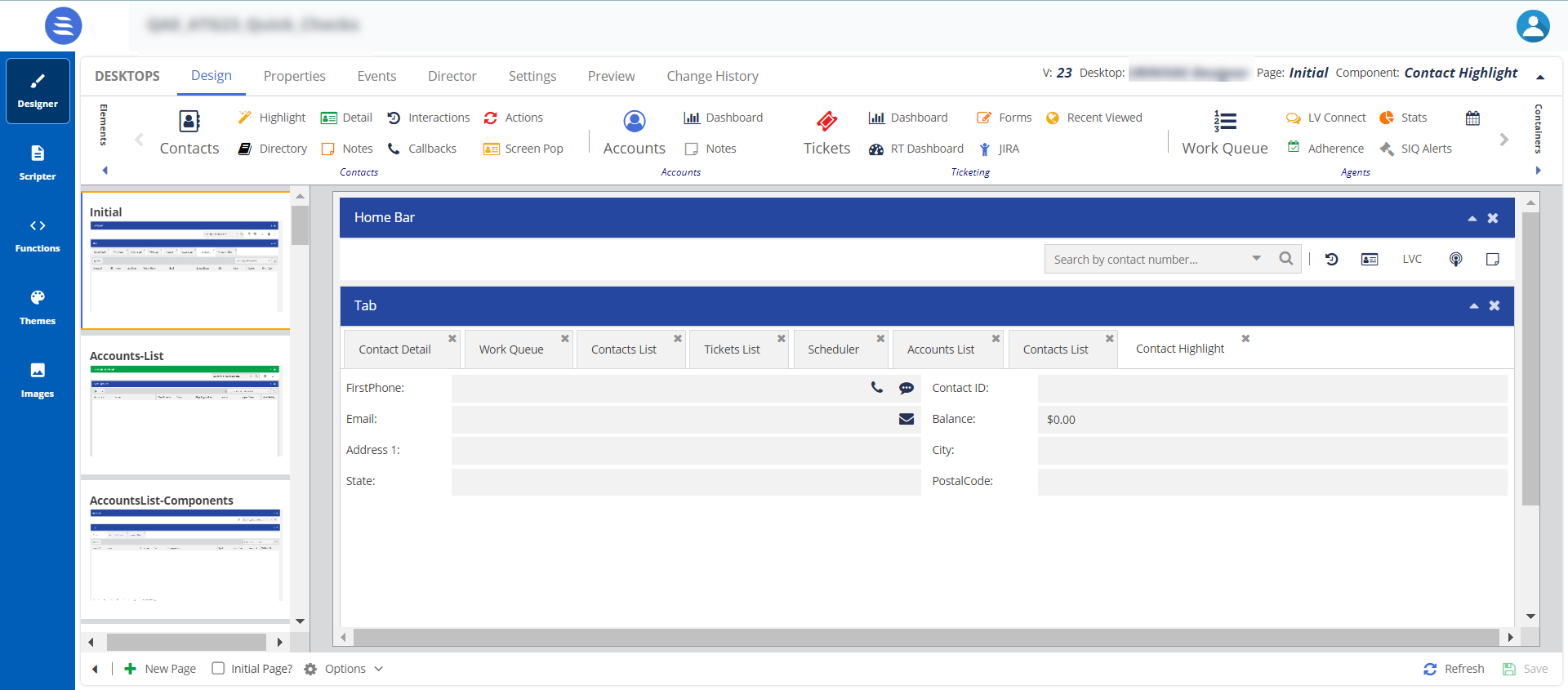
- Select the Contact Highlight element on the canvas, then click the Properties tab.
The Properties and Events tabs are enabled only when the element is selected on the canvas.
- The properties for Contact Highlight are shown.

Number Property Available Features Expected Result Content Title You can change the default title of an element. When you change the title, the element name on the canvas is updated to the new title. For example, you can change the title from Contact Highlight to Highlight, and the name is updated on the tab on the canvas. Styles Header, Header Position, and Theme To change the current formatting, change the Header Position and Theme. When you enable the Header Position option and select the Header Position in the drop-down menu, the header position is updated. Screen Configuration Highlight Screen You can configure the fields for the Contact Highlight in the Designer Desktop. The configurations are used from the Contact Manager
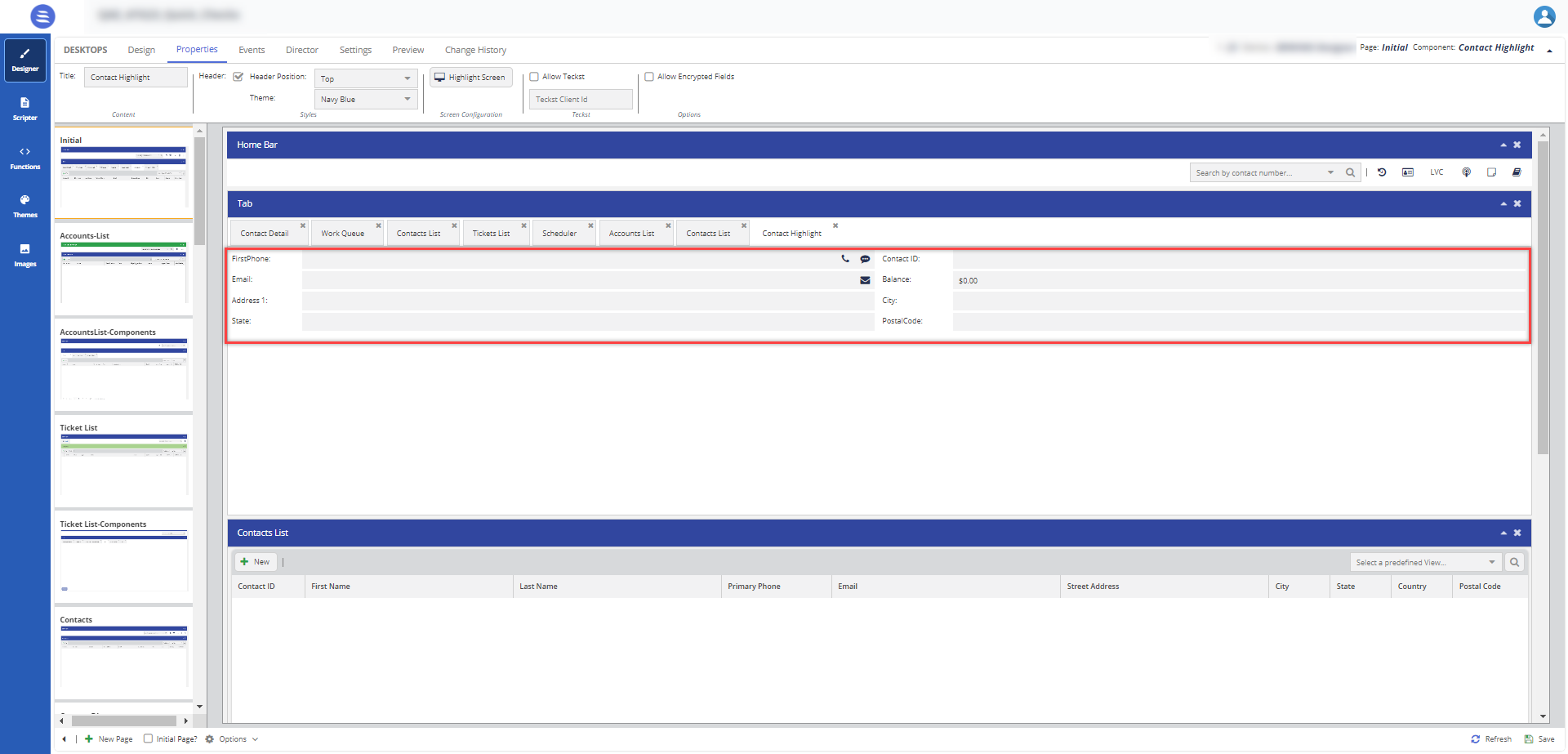
To configure fields in the Contact Highlight window:
- Select the Contact Highlight feature, and then click the Properties tab.
- Click the Highlight Screen button.
The field Configuration for: Contact Highlight window appears.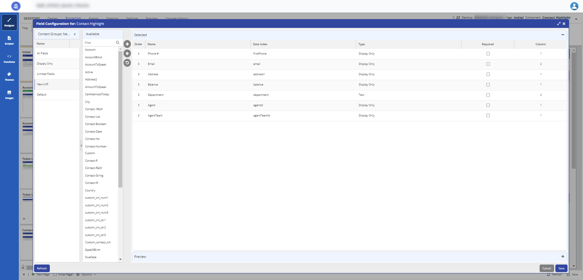
- Select fields from the Available options list and move them to the Select option.

- For easier navigation, use the Contact Groups: <Group Name> fields and move the fields.
The Contact Groups: <Group Name> fields are a collapsible preview option. You can click this option to minimize it.
- After updating the fields, click Save.
The changes are updated in the Contacts Highlight tab.
Allow Teckst Allow Teckst: Specifies if an agent can use the Teckst platform to send SMSes.
When an agent clicks the Compose an SMS icon (
), the Teckst window appears.Teckst Client ID:
- You must specify a value in this field if you have selected the Allow Teckst checkbox. To obtain the Teckst client ID, contact the Customer Care Team.
- If the Teckst platform is not enabled, an agent can still send SMSes through the default SMS window.
Allow Encrypted Fields When you enable this option, you can create five encrypted fields. The data type of these fields should be a string.
Agents have only read access to these fields.
The Contact Directory consists of the email and number of an agent. You can configure view, edit, or hide options in the screen configuration window.
To configure and set the Contact Directory element on the Designer Desktop:
- On the Designer Desktop, select a page where you want to add the Directory element. For example, the initial page where you have the Home bar and Containers configured.
- Drag and drop the Directory element on to the canvas.
The Directory information appears on the Designer Desktop page.
- The elements appear in a tabular form, because you have selected the Container type as Tab. For more information on Containers, see Working with Containers.
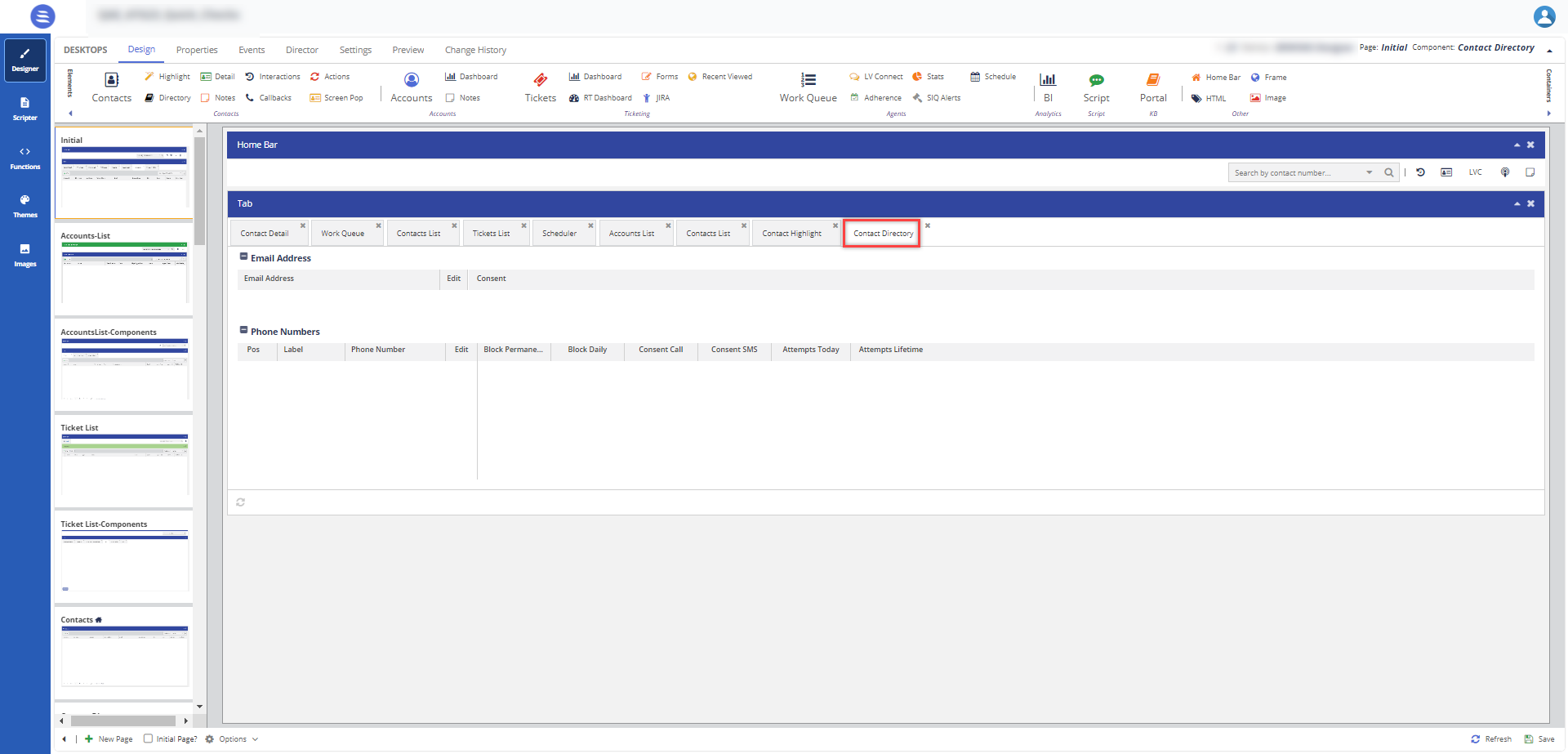
- Select the Contact Directory element on the canvas, then click the Properties tab.The properties for the Contact Directory are shown.
The Properties and Events tabs are enabled only when the element is selected on the canvas.
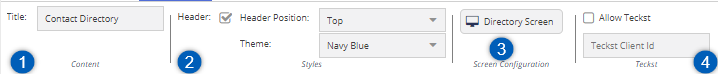
Number Property Available Features Expected Result Content Title You can change the default title of an element. When you change the title, the element name on the canvas is updated to the new title. For example, you can change the title from Contact Directory to Contact Directory Details, and the name is updated on the tab on the canvas.
Styles Header, Header Position, and Theme To change the current formatting, change the Header Position and Theme. When you enable the Header Position option and select the Header Position in the drop-down menu, the header position is updated. Screen Configuration Directory Screen You can configure the fields for the Contact Directory in the Designer Desktop.
To configure fields in the Contact Directory window:
- Select the Contact Directory feature and then click the Properties tab.
- Click the Screen Configuration button.
The Field Configuration for: Contact Directory window appears.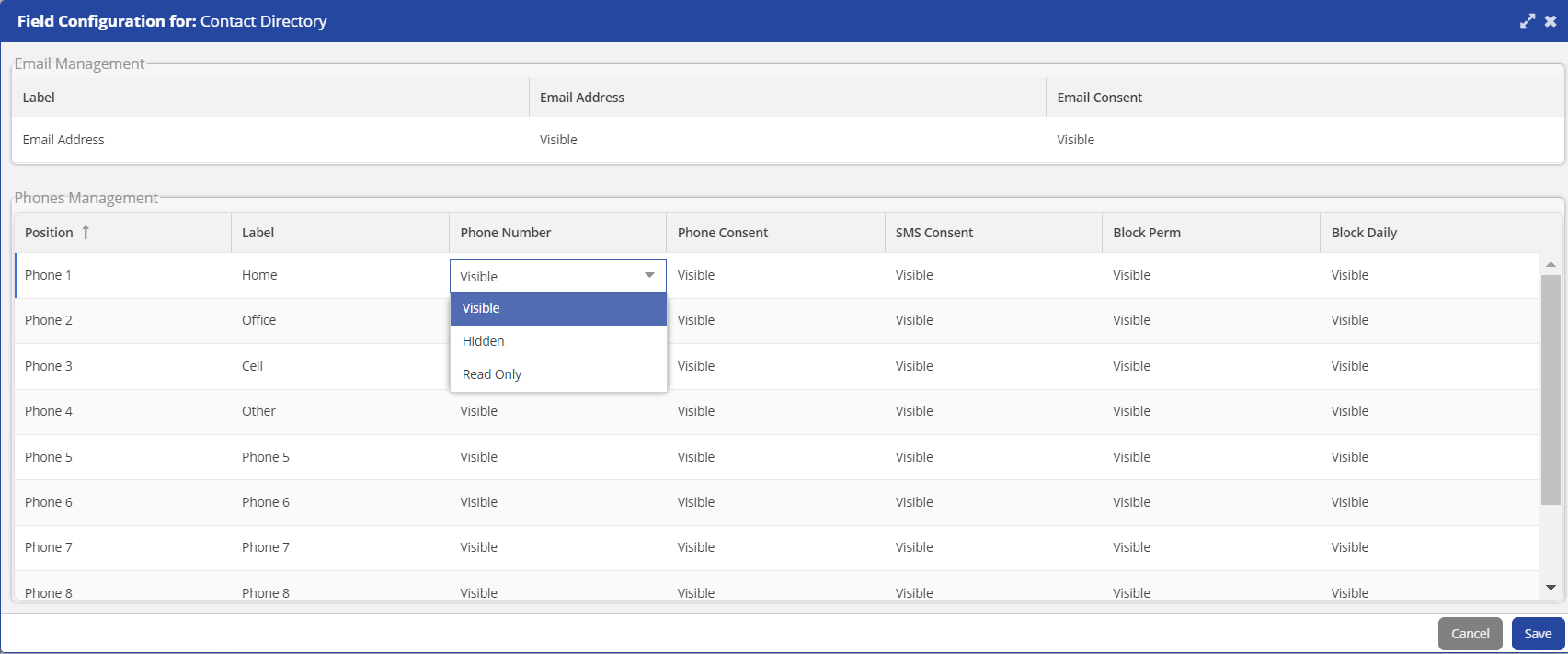
You can create unique screen configurations for agents based on the contact groups on the Contact Center CRM desktop. This is designed for clients with diverse portfolios and ensures that clients are assigned to agents with specific portfolios or contact groups who can view or edit the fields.
Enables you to perform the following actions through the Screen Configuration window:
- Enable or disable phone, email, and SMS consent.
- Specify labels for the phone fields (regardless of how they are labeled in Contact Manager).
- Define which phone numbers to display for agents by enabling or disabling the phone fields.
- You can configure Email Management and Phone Management through the Screen Configuration window. Based on the configuration you set, the agent can view the phone numbers.
By default, all the phone numbers are visible; you must manually set this option to the Hidden, Visible, and Read Only options.
- After updating the fields, click Save.
The changes are updated in the Contacts tab.
Allow Teckst Allow Teckst: Specifies if an agent can use the Teckst platform to send SMSes.
When an agent clicks the Compose an SMS icon (
), the Teckst window appears.Teckst Client ID:
- You must specify a value in this field if you have selected the Allow Teckst checkbox. To obtain the Teckst client ID, contact the Customer Care Team.
- If the Teckst platform is not enabled, an agent can still send SMSes through the default SMS window.
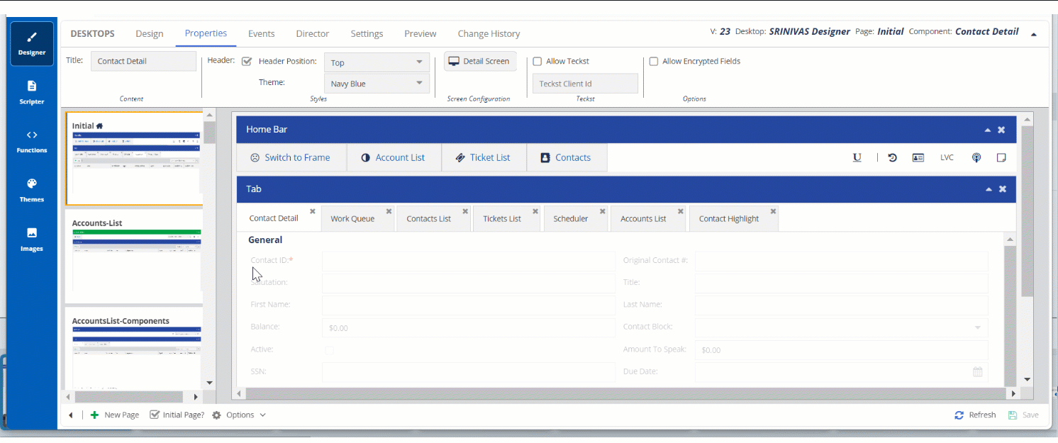
The contact information of a selected contact is listed in the Contact Detail section. When you add this option to the Designer Desktop, an agent can access the configured information on the agent's desktop during calls.
To configure and set the Contact Detail element on the Designer Desktop:
- On the Designer Desktop, select a page where you want to add the Detail element. For example, the initial page where you have the Home bar and Containers configured.
- Drag and drop the Detail element on to the canvas.
The Details element appears on the Designer Desktop page.
- The elements appear in a tabular form, because you have selected the Container type as Tab. For more information on Containers, see Working with Containers.
- Select the Contact Details element on the canvas, and then click the Properties tab.The properties for the Contact Details are shown.
The Properties and Events tabs are enabled only when the element is selected on the canvas.

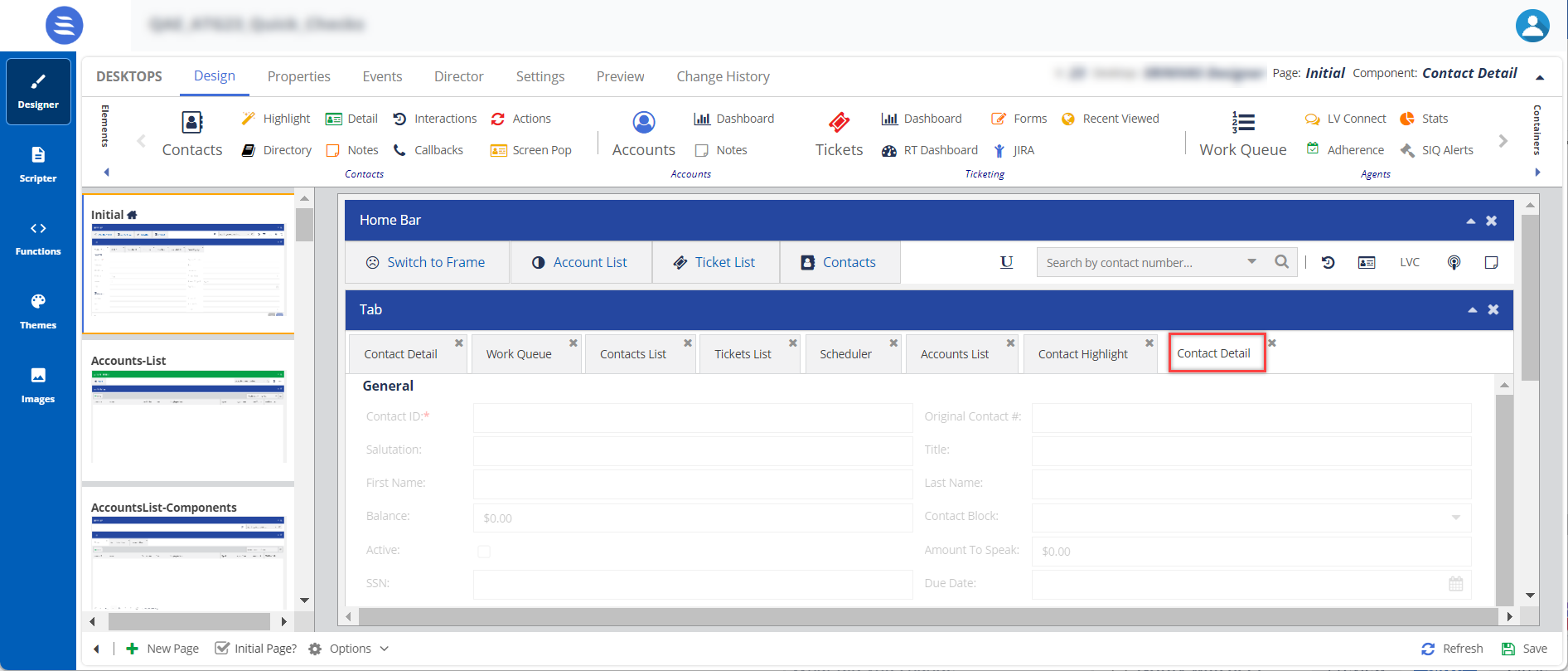
Number Property Available Features Expected Result Content Title You can change the default title of an element. When you change the title, the element name on the canvas is updated to the new title. For example, you can change the title from Contact Detail to Contact Information, and the name is updated on the tab on the canvas.
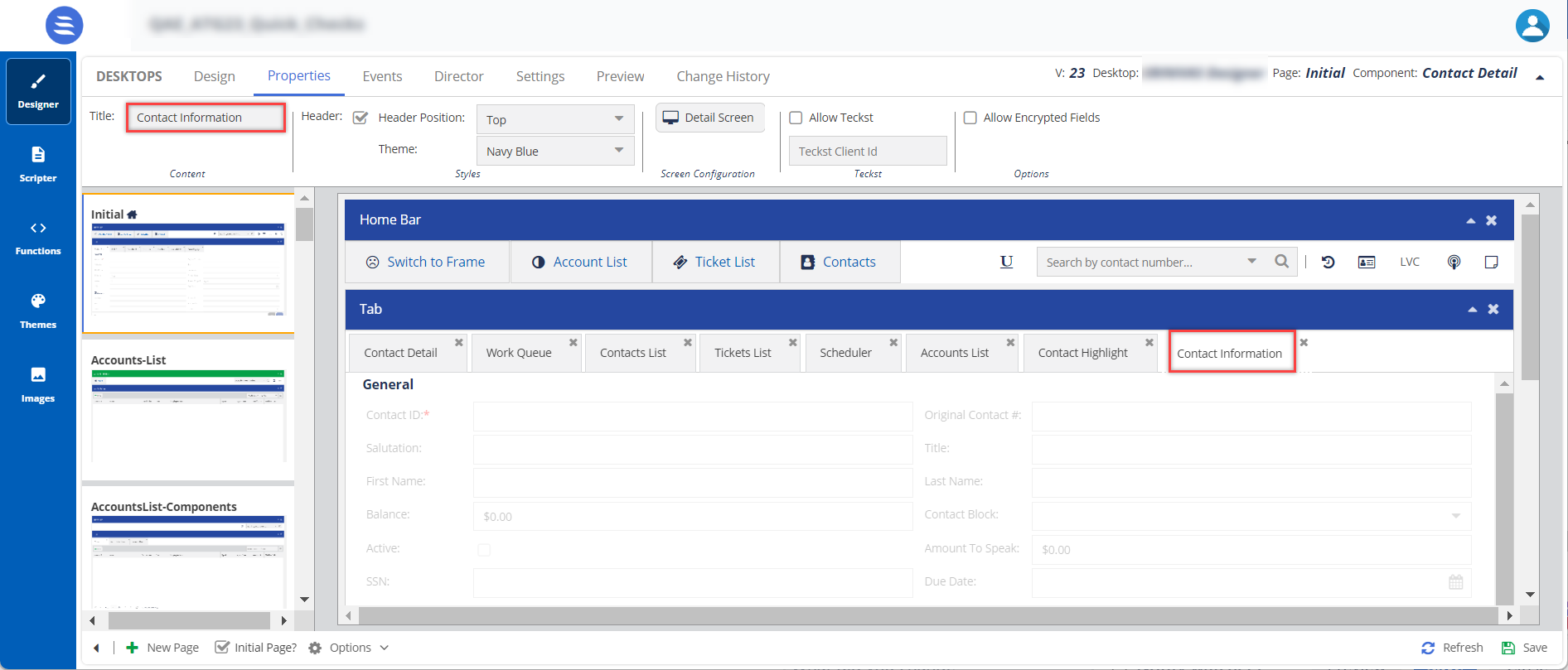
Styles Header, Header Position, and Theme To change the current formatting, change the Header Position and Theme. When you enable the Header Position option and select the Header Position in the drop-down menu, the header position is updated. Screen Configuration Detail Screen You can configure the fields for the Contact Detail in the Designer Desktop.
- Select the Contact Detail feature and then click the Properties tab.
- Click the Detail Screen button.
The field Configuration for: Contact Detail window appears.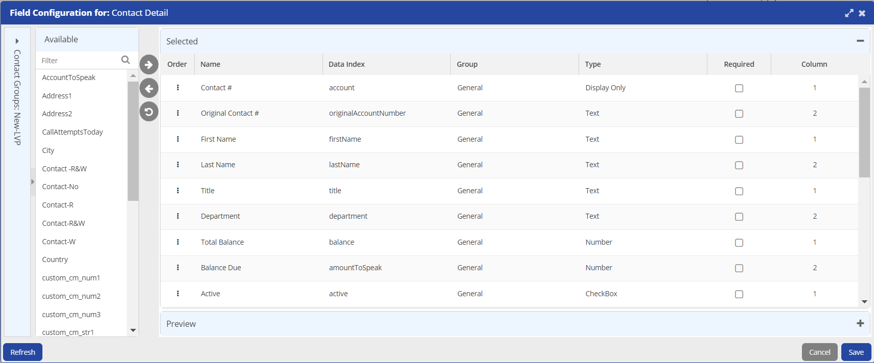
- You can select fields from the Available options list and move them to the Select option.
- For easier navigation, use the Contact Groups: <Group Name> fields and move the fields.
The Contact Groups: <Group Name> fields are a collapsible preview option. You can click the option to minimize it.
- After updating the fields, click Save.
The changes are updated in Contact Details.
Allow Teckst Allow Teckst: Enables you to specify if an agent can use the Teckst platform to send SMSes.
When an agent clicks the Compose an SMS icon (
), the Teckst window appears.Teckst Client ID:
- You must specify a value in this field if you have selected the Allow Teckst checkbox. To obtain the Teckst client ID, contact the Customer Care Team.
- If the Teckst platform is not enabled, an agent can still send SMSes through the default SMS window.
Options When you enable this option, the encrypted fields are enabled when you a view a contact.
You can add the Contact Notes element to the Designer Desktop or as an option on the Home bar. An agent can add notes during or after a call with a customer. This option acts as a notepad for an agent during a customer interaction.
To configure and set the Contact Notes element on the Designer Desktop:
- On the Designer Desktop, select a page where you want to add the Notes element. For example, the initial page where you have the Home bar and Containers configured.
- Drag and drop the Notes element on to the canvas.
The Notes element appears on the Designer Desktop page.
- The elements appear in a tabular form, because you have selected the Container type as Tab. For more information on Containers, see Working with Containers.
- Select the Contact Notes element on the canvas or page, and then click the Properties tab.The properties of the Contact Notes are shown.
The Properties and Events tabs are enabled only when the element is selected on the canvas.
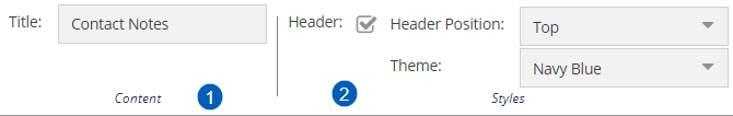
Number Property Available Features Expected Result Content Title You can change the default title of an element. When you change the title, the element name on the canvas is updated to the new title. For example, you can change the title from Contact Notes to Notes, and the name is updated on the tab on the canvas or page.
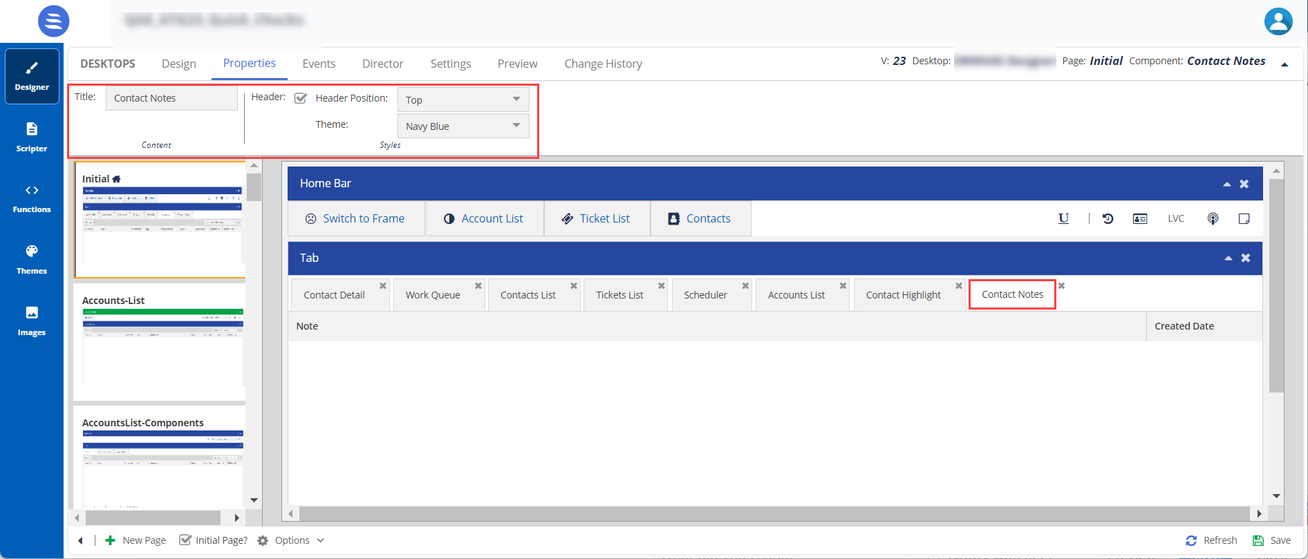
Styles Header, Header Position, and Theme To change the current formatting, change the Header Position and Theme. When you enable the Header Position option and select the Header Position in the drop-down menu, the header position is updated.
The Contact Interactions element displays all contact interactions with the customer.
To configure and set the Contact Interactions element on the Designer Desktop:
- On the Designer Desktop, select a page where you want to add the Interactions element. For example, the initial page where you have the Home bar and Containers configured.
- Drag and drop the Interactions element on to the canvas.
The Interactions element appears on the Designer Desktop page.
- The elements appear in a tabular form, because we have selected the Container type as Tab. For more information on Containers, see Working with Containers.
- Select the Contact Interactions element in the canvas or page, then click the Properties tab.The properties of the Contact Notes are shown.
The Properties and Events tabs are enabled only when the element is selected on the canvas.
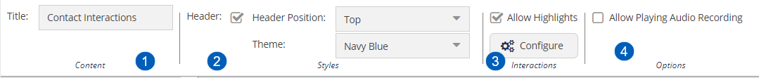
Number Property Available Features Expected Result Content Title You can change the default title of an element. When you change the title, the element name on the canvas is updated to the new title. For example, you can change the title from Contact Interactions to Interactions, and the name is updated on the tab on the canvas or page.
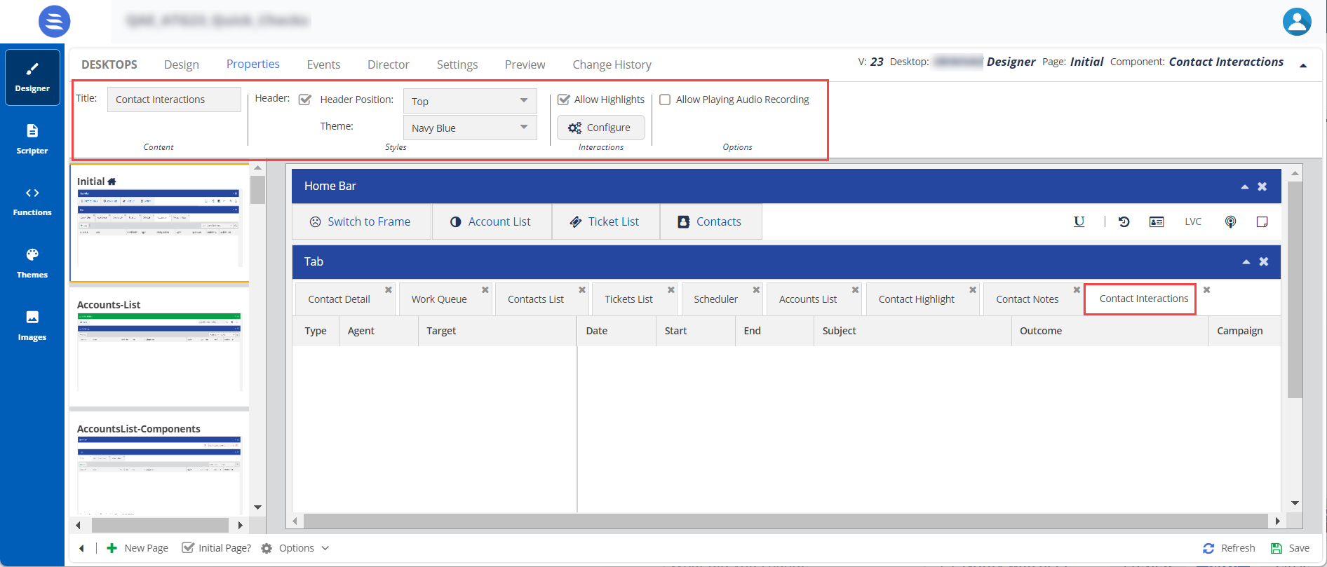
Styles Header, Header Position, and Theme To change the current formatting, change the Header Position and Theme. When you enable the Header Position option and select the Header Position in the drop-down menu, the header position is updated. Interactions Allow Highlights You can configure the fields for the Contact Interactions in the Designer Desktop.
- Select the Contact Interaction feature and then click the Properties tab.
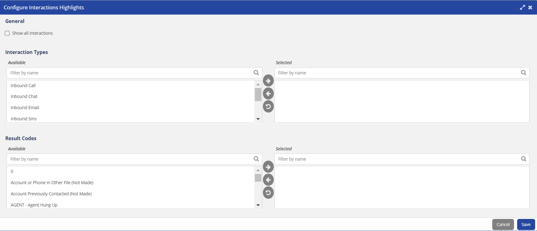
- Enable the Allow Highlights option and click the Configure button.
The Configure Interaction Highlights window appears.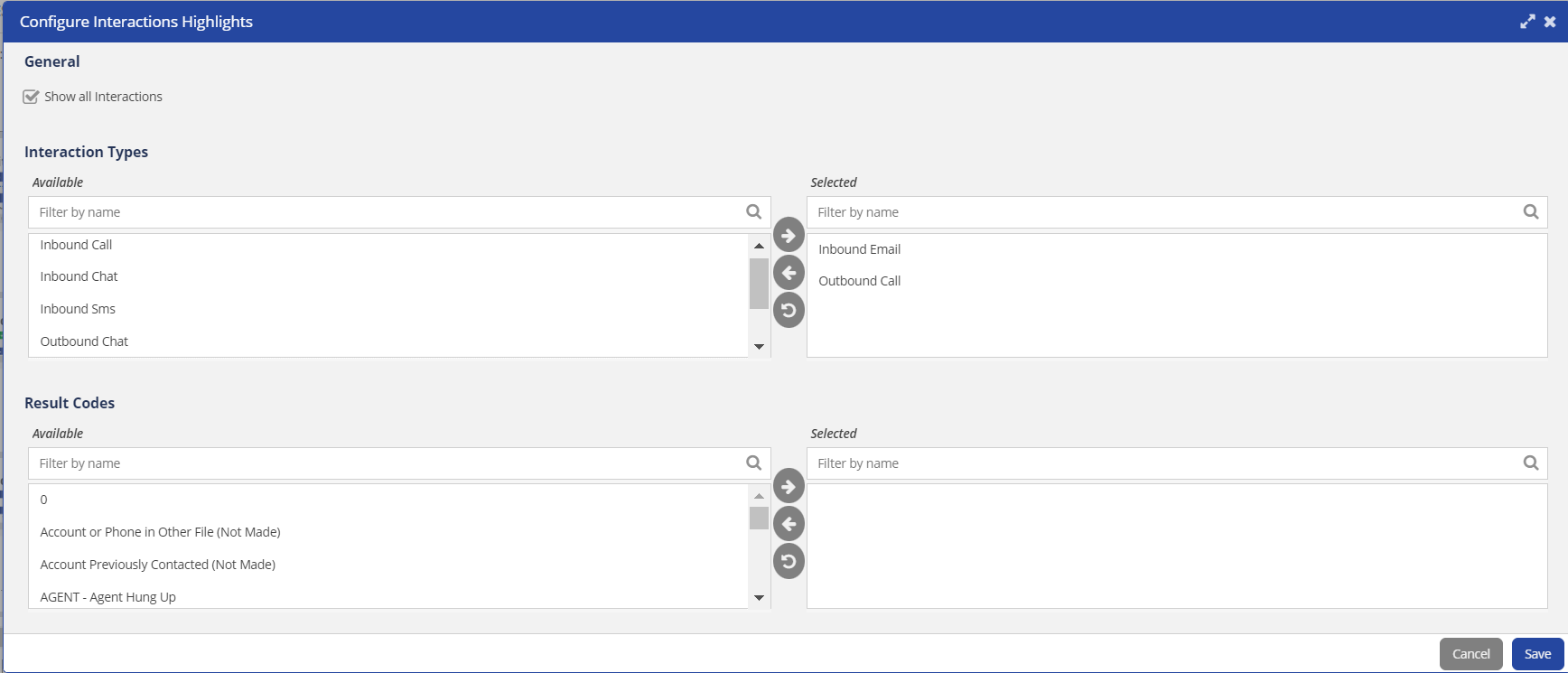
- Enable the Show all Interactions option. This option allows you to see all types of interactions.
- Interaction Types: You can select fields (Interaction Types) from the Available options list and move them to the Selected options list.
- Result Codes: You can select the required Result Codes from the Available options list and move them to the Selected options list.
- After updating the fields, click Save.
The changes are updated on the Contact Interactions page or tab.
Options Allow Playing Audio Recordings Enables any call recordings during a call interaction to be added to the interactions feature on the agent desktop. An agent can use this recording to check information.
You can add the Contact Scheduled Callbacks element to the Designer canvas. This element lists all scheduled callback information for an agent. This helps agents to track and follow up on callback requests with the contact records.
To configure and set the Contact Scheduled Callbacks element on the Designer Desktop:
- On the Designer Desktop, select a page where you want to add the Callback element. For example, the initial page where you have the Home bar and Containers configured.
- Drag and drop the Callbacks element on to the canvas.
The Callbacks element appears on the Designer Desktop page.
- The elements appear in a tabular form, because you have selected the Container type as Tab. For more information on Containers, see Working with Containers.
- Select the Contact Scheduled Callbacks element on the canvas or page, and then click the Properties tab.The properties of the Contact Scheduled Callbacks are shown.
The Properties and Events tabs are enabled only when the element is selected on the canvas.
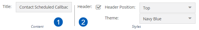
Number Property Available Features Expected Result Content Title You can change the default title of an element. When you change the title, the element name on the canvas is updated to the new title. For example, you can change the title from Contact Scheduled Callbacks to Callbacks, and the name is updated on the tab on the canvas or page.
Styles Header, Header Position, and Theme To change the current formatting, change the Header Position and Theme. When you enable the Header Position option and select the Header Position in the drop-down menu, the header position is updated.
You can add the Contact Actions element to the Designer canvas. This option displays a list of all contact tasks associated with a contact with an advanced search function for an agent. This option allows an agent to create a new task, set priority, and view the status of the tasks.
To configure and set the Contact Actions on the Designer Desktop:
- On the Designer Desktop, select a page where you want to add the Actions element. For example, the initial page where you have the Home bar and Containers configured.
- Drag and drop the Actions element on to the canvas.
The Actions element appears on the Designer Desktop page.
- The elements appear in a tabular form, because you have selected the Container type as Tab. For more information on Containers, see Working with Containers.
- Select the Contact Actions element on the canvas or page, then click the Properties tab.The properties of the Contact Actions are shown.
The Properties and Events tabs are enabled only when the element is selected on the canvas.
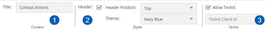
Number Property Available Features Expected Result Content Title You can change the default title of an element. When you change the title, the element name on the canvas is updated to the new title.
Styles Header, Header Position, and Theme To change the current formatting, change the Header Position and Theme. When you enable the Header Position option and select the Header Position in the drop-down menu, the header position is updated. Teckst Allow Teckst,
Teckst Client Id
Allow Teckst: Specifies if an agent can use the Teckst platform to send SMSes.
When an agent clicks the Compose an SMS icon (
), the Teckst window appears.Teckst Client ID:
- You must specify a value in this field if you have selected the Allow Teckst checkbox. To obtain the Teckst client ID, contact the Customer Care Team.
- If the Teckst platform is not enabled, an agent can still send SMSes through the default SMS window.
The Screen pop option appears during a call interaction; when an agent dials a call to a customer, a screen pop appears requesting the account number for the caller. An agent adds the number and makes a call, and this information is logged.
To configure and set the Screen Pop element on the Designer Desktop:
- On the Designer Desktop, select a page where you want to add the Screen Pop element. For example, the initial page where you have the Home bar and Containers configured.
- Drag and drop the Screen Pop element on to the canvas.
The Screen Pop element appears on the Designer Desktop page.
The elements appear in a tabular form, because you have selected the Container type as Tab. For more information on Containers, see Working with Containers.
- Select the Screen Pop element on the canvas or page, then click the Properties tab.The properties of the Screen Pop are shown.
The Properties and Events tabs are enabled only when the element is selected on the canvas.
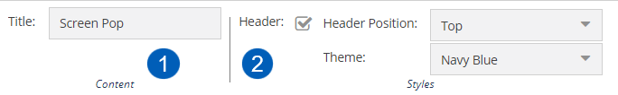
Number Property Available Features Expected Result Content Title You can change the default title of an element. When you change the title, the element name in the canvas is updated to the new title.
Styles Header, Header Position, and Theme To change the current formatting, you can change the Header Position and Theme. When you enable the Header Position option and select the Header Position in the drop-down menu, the header position is updated.