Download PDF
Download page Designing a Dashboard and Panel.
Designing a Dashboard and Panel
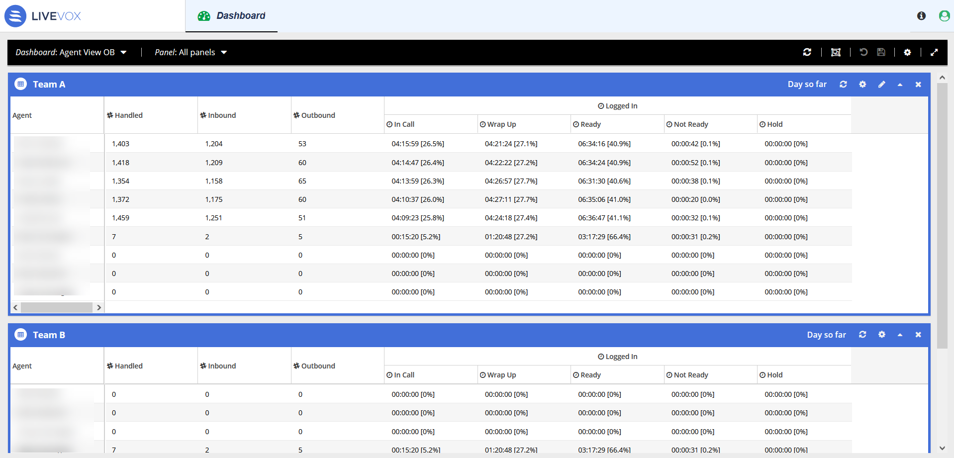
To display a dashboard on a screen for you or others to see (that is, to use a dashboard as a wallboard), besides creating a dashboard, you must configure the panels of the dashboard so that they can be easily viewed on the intended screens (for example, widescreen office monitors). Such configuration also involves defining the font size and panel color as appropriate. The following image displays two panels (Team A and Team B) of the Agent View OB dashboard.
The following procedure describes how to create a dashboard and design a panel for that dashboard at the same time. You can, however, design a panel for a dashboard anytime.
You can create as many dashboards as you need.
To create a dashboard and design a dashboard panel:
On the Dashboard menu, click the Create a new dashboard icon
 .
.
The New dashboard row appears in the Personal section.You can change the type of dashboard to shared or personal anytime. For information about how to do so, see Dashboard Menu.
A dashboard is created.
Enter a name for the dashboard by using the Rename the selected dashboard icon
 , and then close the Dashboard menu.
You can rename the dashboard anytime. For information about how to do so, see Dashboard Menu.
The New panel window appears.
You can rename the panel anytime.
Click the Edit this panel icon
 .
.
The Editor window appears.You can modify the font size and frame color for the panel by using the gear icon
 .
. - The default view of the panel is a grid (with rows and columns). You can, however, change the view.
- The names of the tabs that appear in the Editor window depend on the view. For example, for the grid view, the Rows and Columns tabs appear, whereas, for the bar chart view, the Bars and Topic tabs appear.
- For more information, see Customizing the Panel Views.
The following steps in this procedure assume that you have retained the default view (Grid).
- On the Rows tab, click
 .
.
The following options (subjects) appear:- Agencies, call centers and services
Agents
Select the subject for which you want to display the metrics on the panel.
Parameters related to the selected subject appear, each displaying a checkbox.To view the checkboxes, expand the parameters.
Select the checkbox next to each parameter for which you want to display the data on the panel.
- To filter the parameters based on a name, in the Filter by label box, enter the name.
- To select all the parameters at once, select the checkbox next to the subject.
- To view only the selected parameters, click the Filter options icon
 , and then select the Show selected only checkbox.
- On the Columns tab, click .
The following options (statistic types) appear:- Historical stats: Past statistics for the current day (for example, last two hours or until the current time).
- Real-time context: Statistics in real time.
Select the statistic type for which you want to display the parameters on the panel.
Parameters related to the selected statistic type appear, each displaying a checkbox.- To view the checkboxes, expand the parameters.
- If you selected the Historical stats statistic type, the Interval menu appears, from which you can select one of the following periods for historical statistics:
- Custom interval (a period that you want)
- Day so far (a period starting from the time that the current day began until the current time)
- Last two hours
- Last hour
- Last 30 minutes
- Last 15 minutes
- To learn about a parameter, hover over it. For more information about the parameters, see Viewing the Panel Statistics.
- Some parameters appear in a color other than black. The parameters that appear in the same color (other than black) together represent a group, which is used in the calculation of percentages in some panels of the dashboard.

Select the checkbox next to each parameter for which you want to display the data on the panel.
- To filter the parameters based on a name, in the Filter by label box, enter the name.
- To select all the parameters at once, select the checkbox next to the statistic type.
- To view only the selected parameters, click the Filter options icon , and then select the Show selected only checkbox.
To sort the data for the selected parameters in ascending or descending order:
- On the Sort By menu, click the Add a new sort criterion icon
 .
.
- Double-click the Sort by cell.
A list of selected parameters appears. Select the parameter whose data you want to be sorted in ascending or descending order, and then, as required, select the option in the ASC (ascending) or DESC (descending) column.
- You can add multiple sort criteria by using the plus icon.
- You can modify the order of sorting by using the drag-and-drop operation within the table.
- You can delete a sort criterion by using the Delete the selected criterion icon
 .
.
- You can add multiple sort criteria by using the plus icon
- On the Sort By menu, click the Add a new sort criterion icon
If you want to define the service-level agreement values (SLAs) for the applicable parameters (based on which alerts are displayed) for the panel:
- Click the SLA tab.
A table with the selected statistic parameters appears.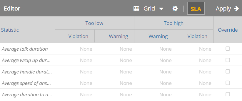
- In the rows displaying the parameters for which you want to define SLAs, as required, in the Too low and Too high columns:
- Double-click the Violation cell, and then enter a value.
- Double-click the Warning cell, and then enter a value.
If you want the SLAs that you have defined for a parameter to take precedence over the default SLAs, select the Override checkbox in the row displaying that parameter.
For information about SLAs, see Defining the Service Level Agreements (SLAs).
Click the gear icon
.
The Abandon threshold field appears.- Abandon threshold refers to the time period beyond which a call is considered abandoned when disconnected by a customer. This value is represented in seconds.
- By default, the Abandon threshold field displays the Default value, which refers to the abandon threshold set for all dashboards (global preference). For more information, see Defining Default Abandon Threshold.
- Select a value in the field.
- Click the SLA tab.
Click Apply.
A preview of your changes appears next to the Editor window.In the preview pane, click the gear icon
 .
.
The Percentages option appears.For the pie chart view, the Display mode option also appears, hovering over which displays the following options:
- Labels only: Displays a label for each pie of the chart next to the pie.
- Legend only: Displays a section describing each pie of the chart outside the chart.
- Labels & legend: Displays both labels and legend.
- Hover over the Percentages option, and then select one of the following options:
- Percentages only: Displays the data on the panel in percentages.
- Values only: Displays the data on the panel in values.
Values & Percentages: Displays the data on the panel in both values and percentages.
You can revert all your changes (before you save them) by using the Undo pending edits icon .
.
Click the Save changes icon
 .
.
Your changes are saved.
If you modify the panel and click the Undo pending edits icon
, all the changes made to the panel until the current time—including those that were earlier saved by using the Save changes icon —are lost.
To create another panel for the dashboard, on the Panel menu, use the Add a panel to the selected dashboard icon ![]() .
.