, now integrated into the Nice CXOne platform and rebranded as has been redesigned to align with CXOne's interface. These changes provide a streamlined, consistent user experience across the integrated
Portal Redesign
A major update to the look and feel of the product is the change in the color palette. Primary colors, accent colors (buttons, highlights), alerts, errors and notification colors, background and sidebar colors, and text colors have been changed to match the CXOne color palette. Icons and button have been updated to match the CXOne style for a streamlined user journey. This rebranding effort is ongoing and we will continue to update the user interface over a series of product versions.
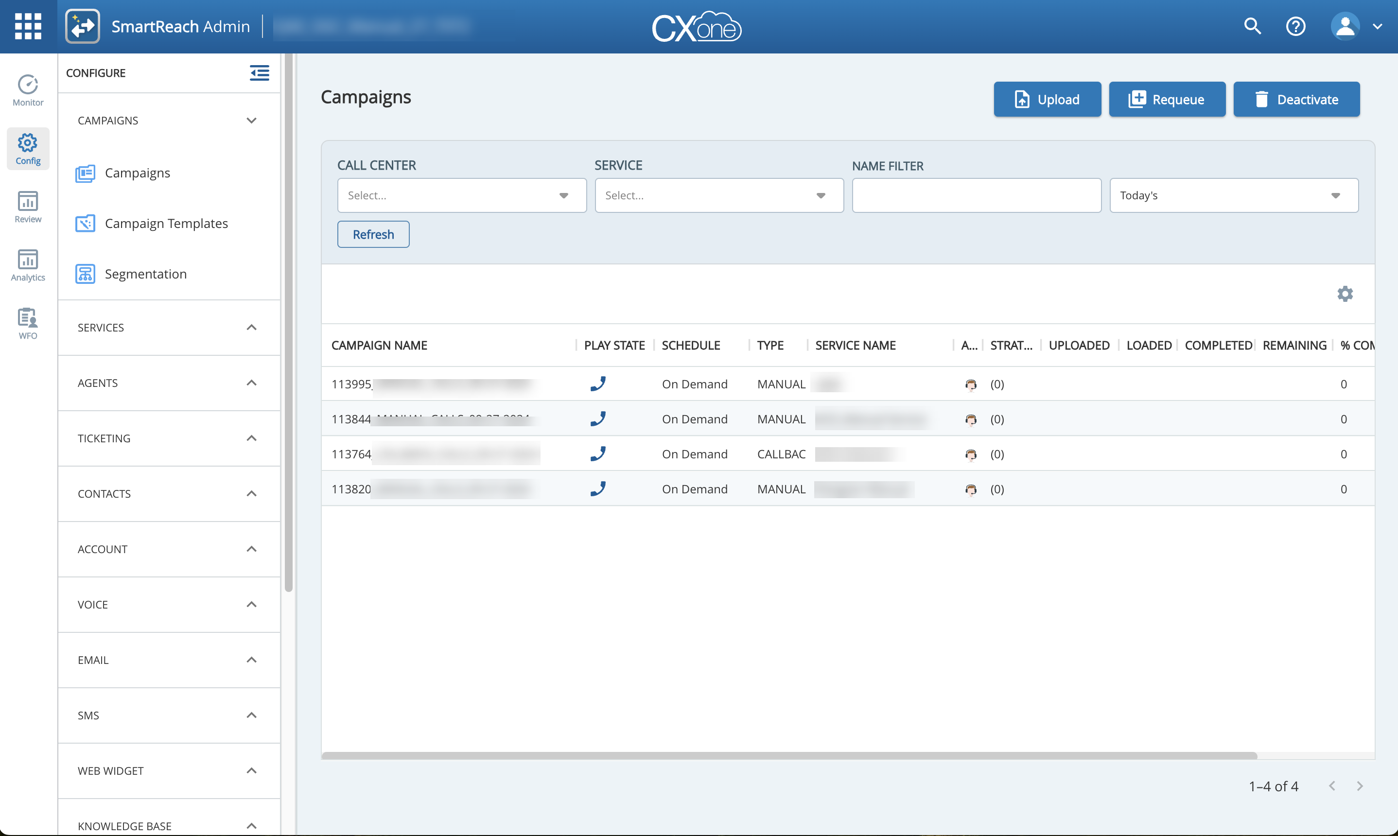
Other key UI changes are discussed below.
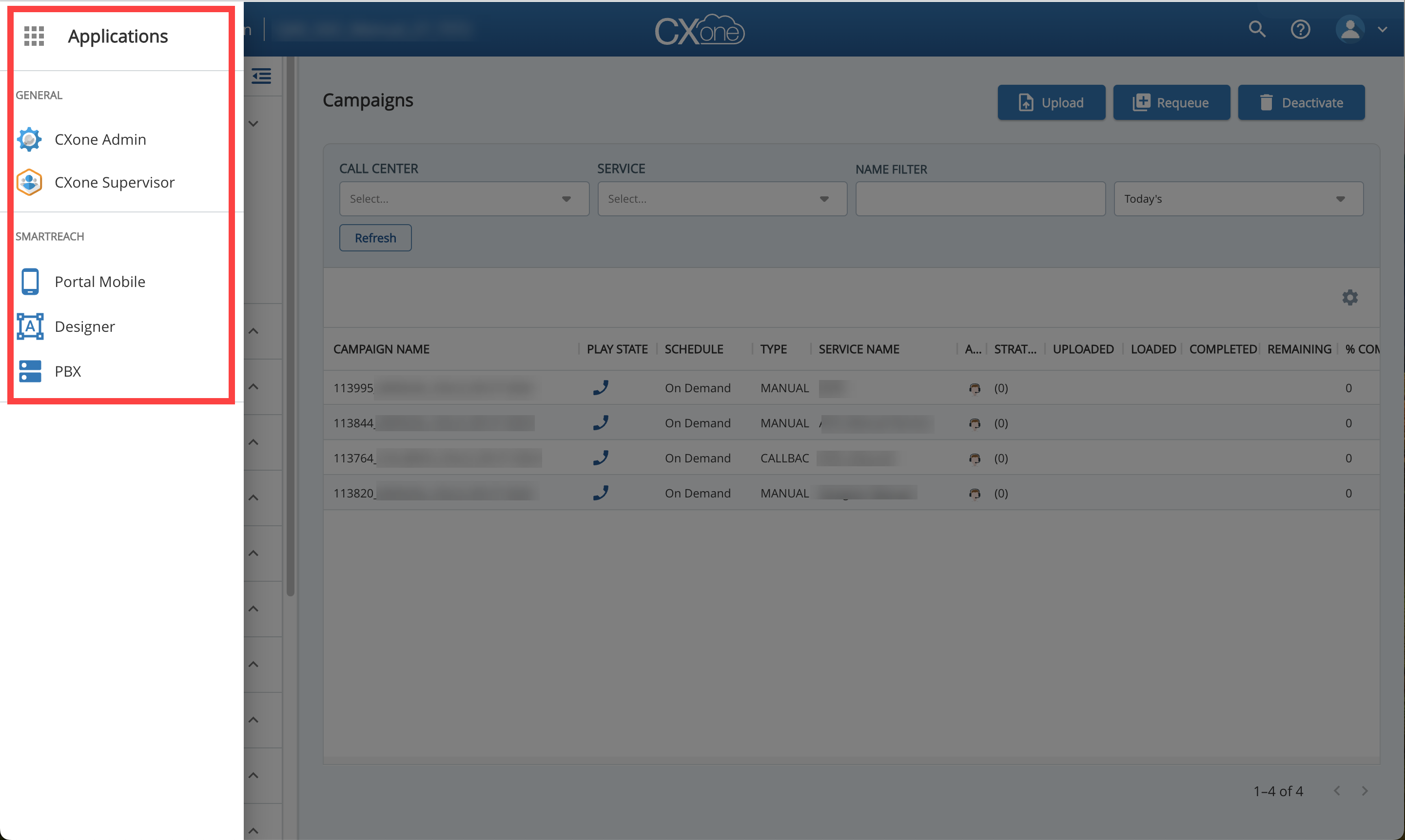
Access to Applications
Previously, in Spring 24 and earlier versions, applications, such as Portal Mobile, Designer, and PBX were accessed using the  icon on the right side. on the left side and can be accessed using the
  icon. For more information about the CXOne applications, see CXOne Integration.
Application Bar
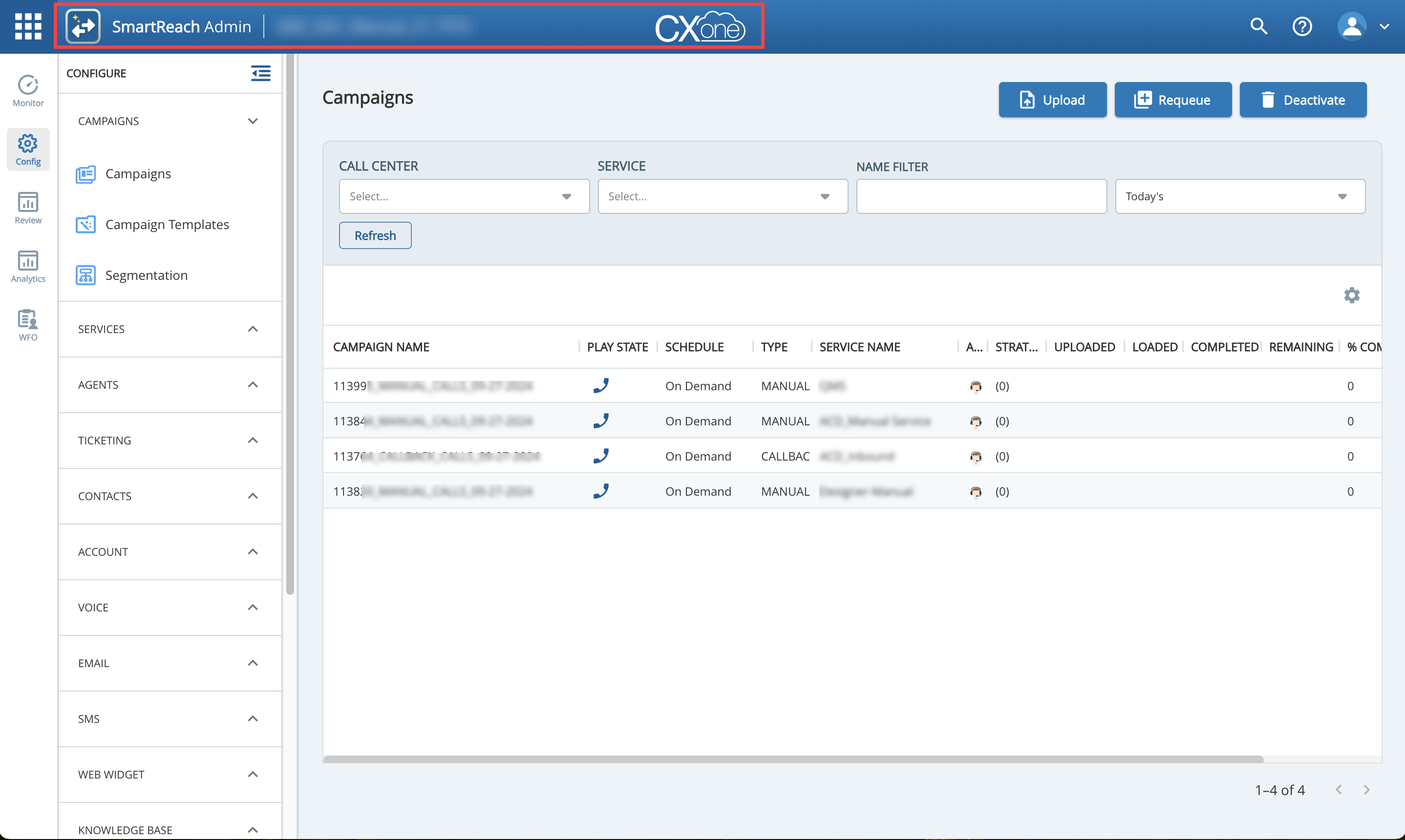
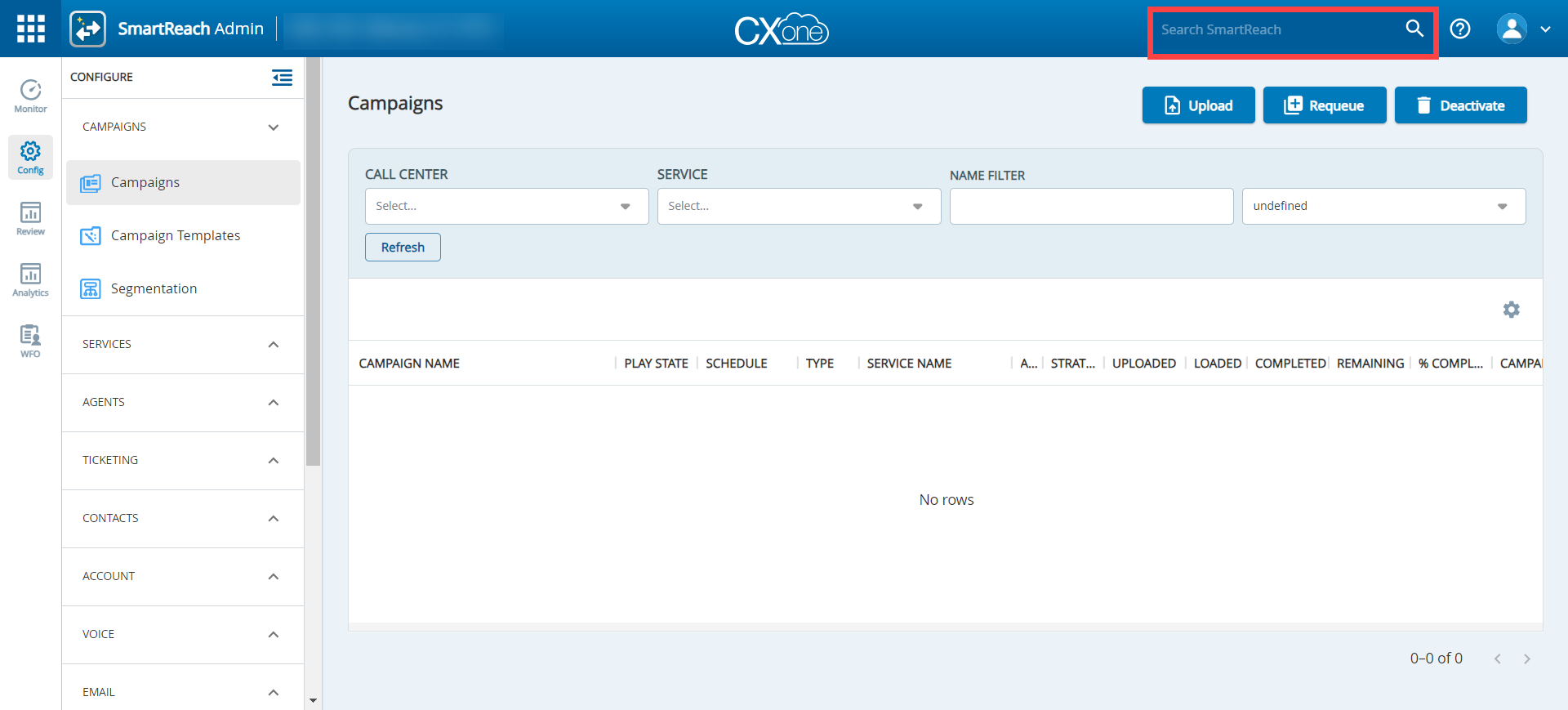
The SmartReach and CXOne logos are now displayed prominently on the application bar.
Navigation Bar
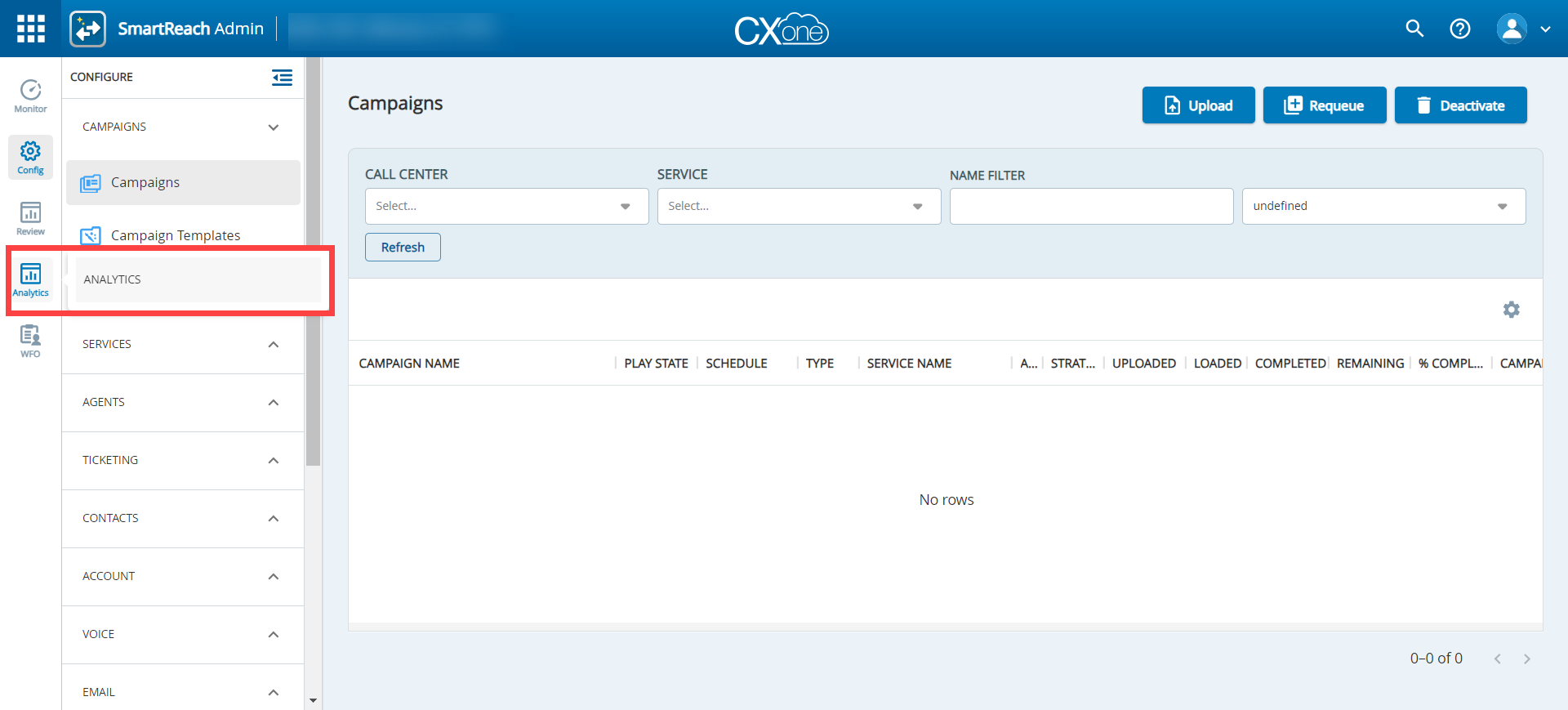
Hovering over a menu item provides detailed information about that item for easier navigation.
Search Field
Clicking  expands the search field.
Auto suggestions: As you type, the search bar now provides real-time suggestions based on search option.
Side Collapsible Panel
The side panel is now collapsible for better usability. Clicking  collapses the left-hand menu. After it is collapsed, clicking the key function reopens the menu item.
