Download PDF
Download page Setting the Style.
Setting the Style
Introduction
After creating the pages, you must add controls/elements to the pages. The Styles tab enables you to set the appearance of the controls. As an example, you will be creating two pages, Starting and Header pages, and adding the text and images.
The Starting Page
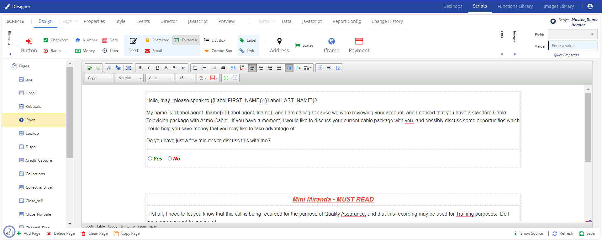
The starting page acts as a landing page. The information below describes the procedures involved in creating a page, introduction about the subscription plan, and seeks permission from the customer to move further with the call. You will be creating the page, as shown in the image below.

Adding a Page Layout
Before adding the text, you need to add a row so that managing the content is easier. This process is called the page layout.
To add a page layout:
- Click the Table option from the formatting toolbar.

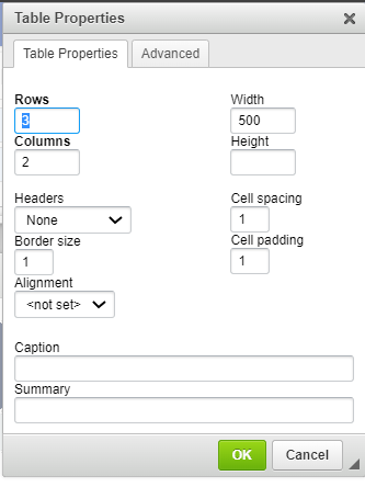
- In the Table Properties window, specify the row, columns, cell padding, border, and width of the row.

Click OK.
Adding a Starting Page
To add content and apply a style to the content:
- Before adding the text, create a page layout.
Position your cursor on the screen with the layout and begin typing the text.
For example:Hello, may I please speak to {{Label.FIRST_NAME}} {{Label.LAST_NAME}}?
My name is {{Label.agent_fname}} {{Label.agent_lname}} and I am calling because we were reviewing your account, and I noticed that you have a standard Cable Television package with Acme Cable. If you have a moment, I would like to discuss your current cable package with you, and possibly discuss some opportunities which could help you save money that you may like to take advantage of.
Do you have just a few minutes to discuss this with me?
- To add the label control to the page:
- In the Field field, select the field that you want to add to the page.
- On the canvas, place your cursor in the location where you want to add the control.
Drag and drop the
 Label element from the Elements section to the canvas.
The parameter for {{Label.FIRST_NAME}} {{Label.LAST_NAME}}, and {{Label.agent_fname}} are created in the Data tab. For more information see Adding Data.
- Use the options from the formatting toolbar and format your text.

To add the Yes or No radio buttons, drag and drop the
 element from the Elements toolbar. Type Yes and No next to the radio buttons.
The properties and events to trigger when the subsequent buttons are selected are defined in the Properties and Events tab. For more information, see Setting Properties and Events for the Elements.
- To add a text box, drag and drop the
 Text element to the design area.
 - Click Save.
The page is saved.
The Header page
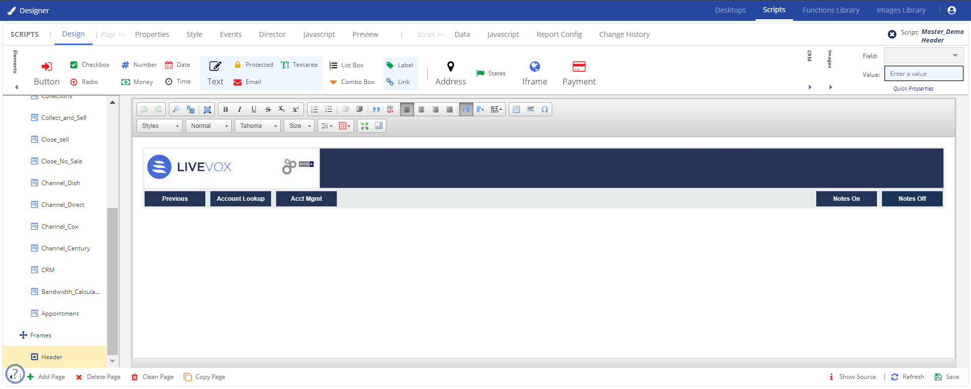
The header page appears on every page of the script. You can enable controls in the header page to manage the activities in the other pages. You will be creating the page as shown in the image below.
To create content and style for the header page:
- Before adding the text, create a page layout.
- Position the cursor where you want to add the image. drag and drop the required images from the Image Libary.
For more information on uploading an image to the Image library, see Image. - For adding the Previous button to the page, drag and drop the
 button element from the design area.
 - Set the button style using the options from the Styles toolbar.

You can similarly add the other buttons. For example, Account Lookup and Account Management.
- You can set the button text from the Properties tab. For more information on changing the button text, see Setting the Style.
- If the text is too long, you can adjust the width using the Width option from the Styles toolbar.
- Click Save.
The Standard Page
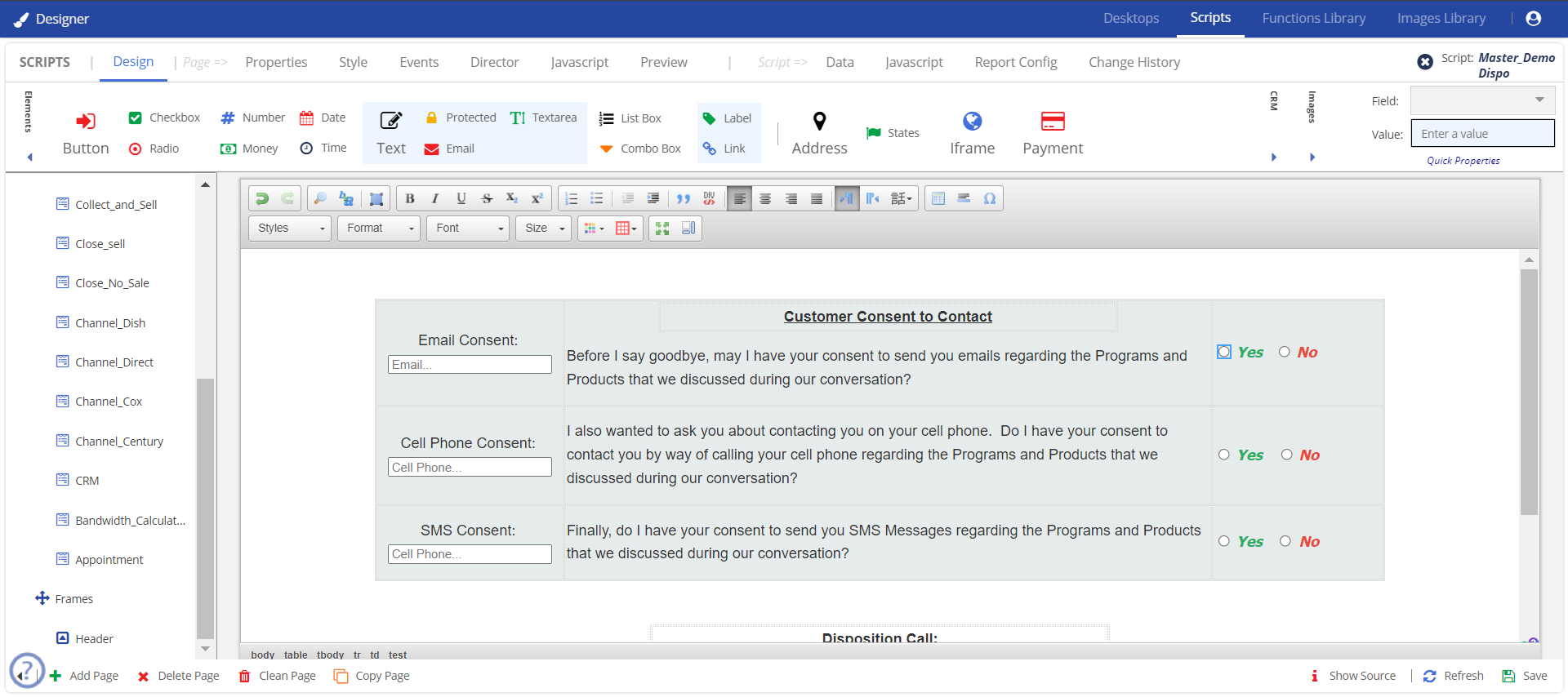
The standard page is the basic page or the following pages that you add after the starting page. To further elaborate on the example, create a consent page, add the required content, and elements/controls to the page. You are creating the page, as shown in the image below.

To create content and style for the standard page:
- Before adding the text, create a page layout.
You must add three rows and three columns to add the above information. - Type the required text within the rows.
- To add the radio buttons, drag and drop the radion from the Elements area to the design area. Add the buttons as shown in the image and type Yes and No next to the button.
- To add the text box, drag and drop the text box from the Elements area to the design area. For adding text in the text box, see Setting Properties and Events for the Elements.