Download page Accessing the SpeechIQ Analytics Dashboard.
Accessing the SpeechIQ Analytics Dashboard
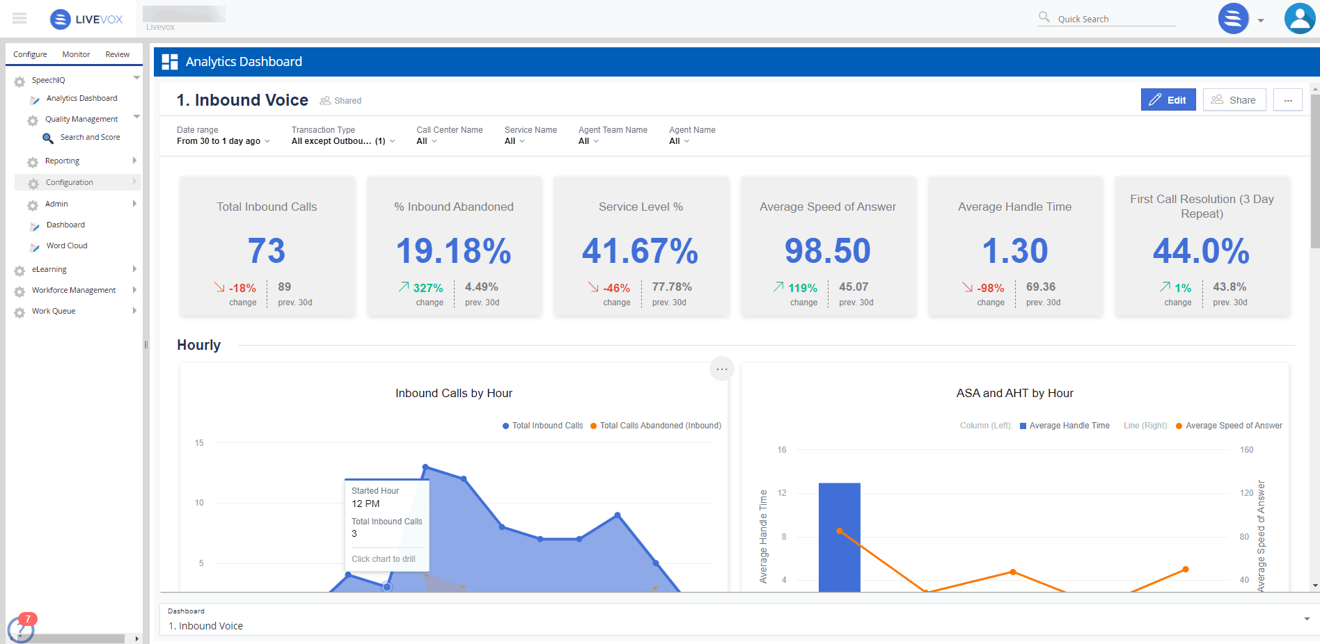
The Analytics Dashboard under SpeechIQ is a collection of widgets which provide data such as reports and metrics at-a-glance. It provides excellent reporting and intelligence capabilities at your fingertips.
The SpeechIQ Analytics Dashboard is available to only customers with BI enabled. Contact your Account team to enable this feature.
To access the Analytics Dashboard, navigate to WFO tab → SpeechIQ → Analytics Dashboard.
The following widgets are part of the dashboard:
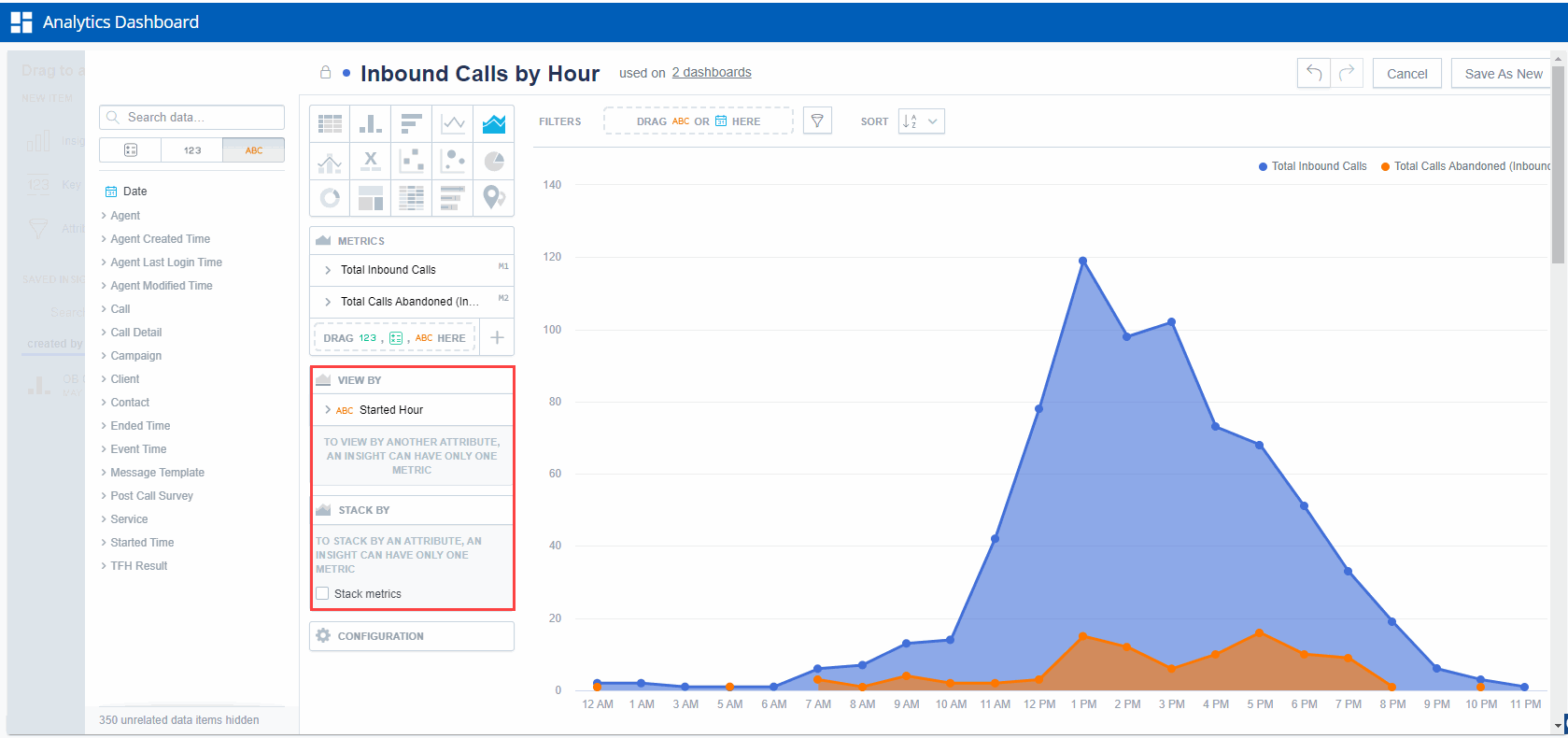
Total Inbound Calls - shows the total number of inbound calls over a filterable period of time.
% Inbound Abandoned - shows the % of inbound calls that were abandoned over a filterable period of time.
Service Level % - shows the quality of service of the answered calls over a filtered period of time.
Average Speed of Answer - shows the average speed with which a call is answered over a filterable period of time.
Average Handle Time - shows the the average handle time over a filterable period of time.
First Call Revolution - shows the % or number of repeat callers over a filtered period of time.
You can filter the time period over which you want the data displayed using the Date range filter.
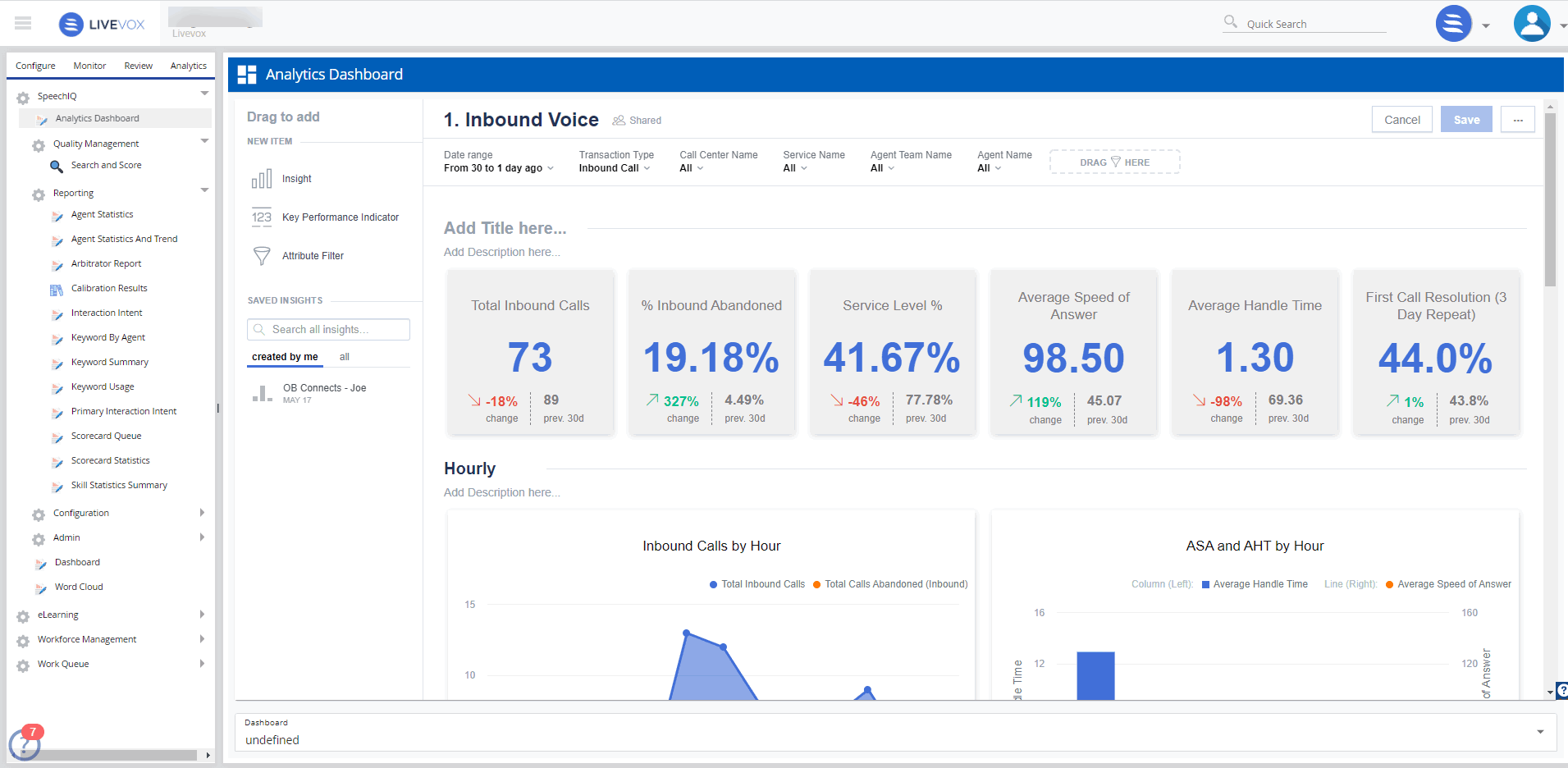
Customizing the Analytics Dashboard
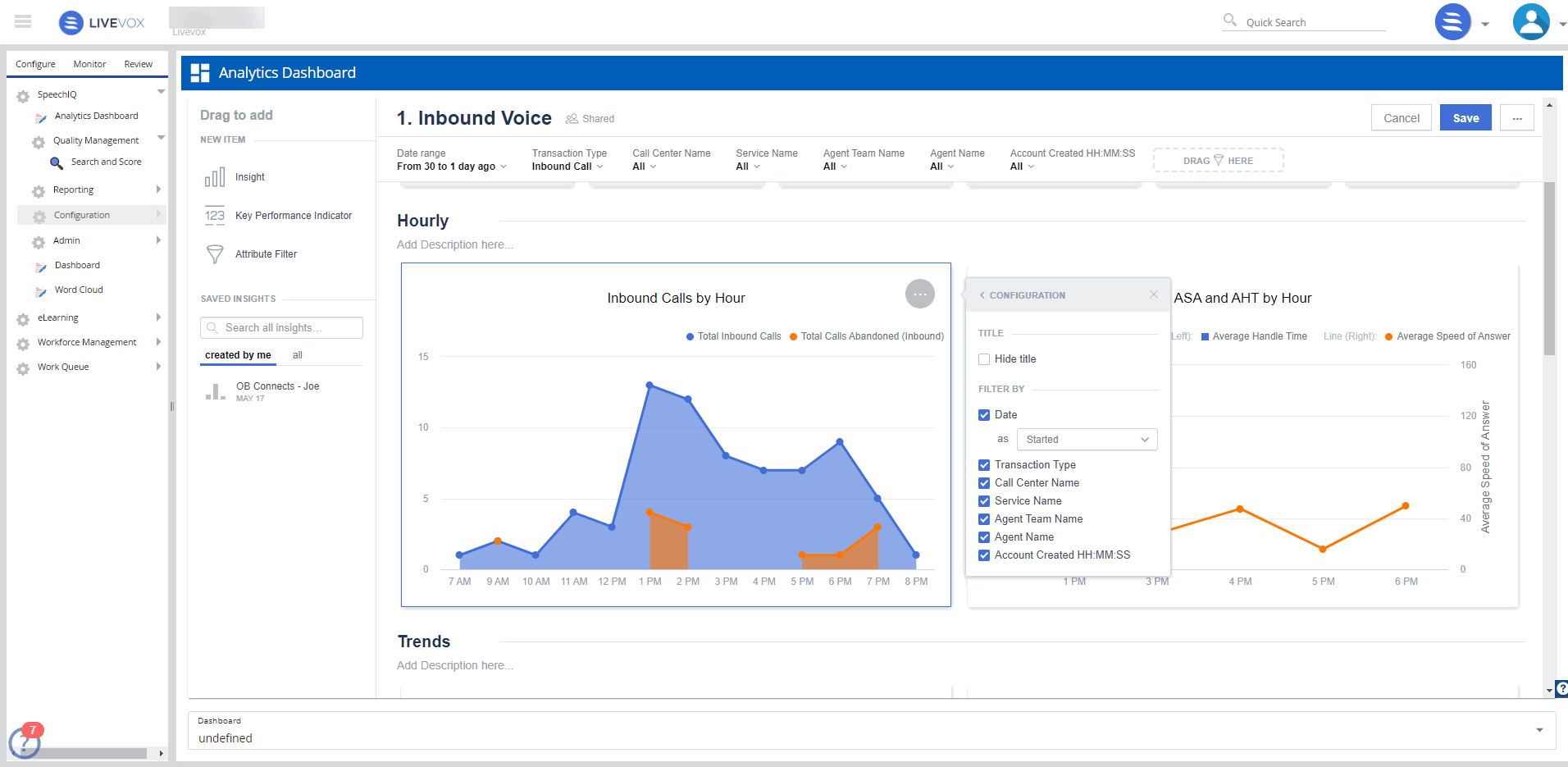
You can edit the Analytics Dashboard and select the filters you want to use, the kind of charts you want to use, and the data that you want to see.
To edit or customize the dashboard:
Click the Edit button.
Drag the Attribute Filter to the Drag Here holder and select the filter you want to add.
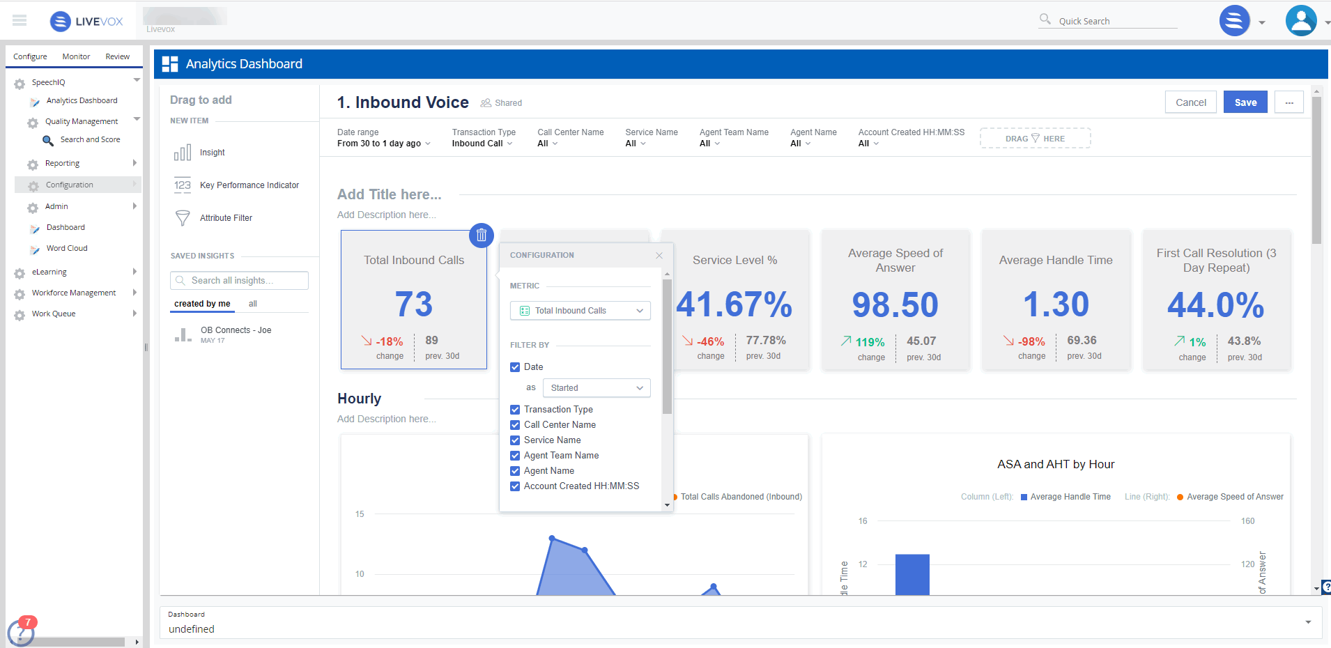
To customize the cards:
Click on each of the cards to configure the metric and filter options.
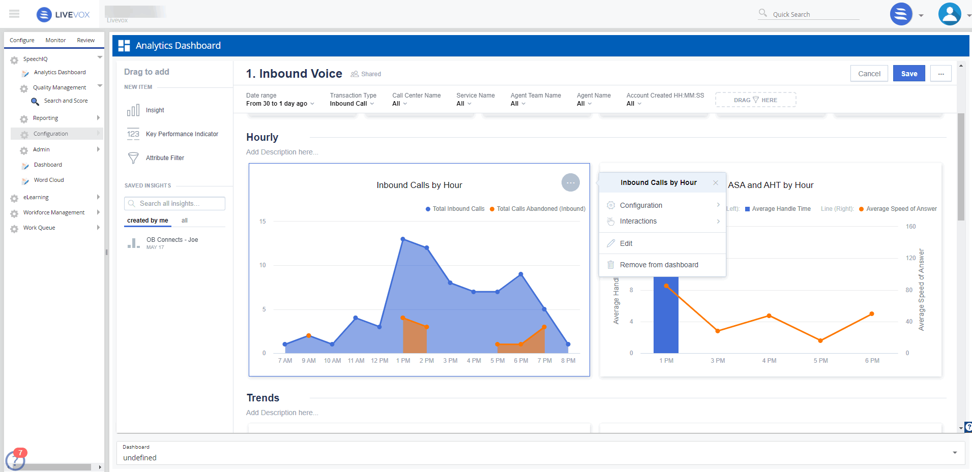
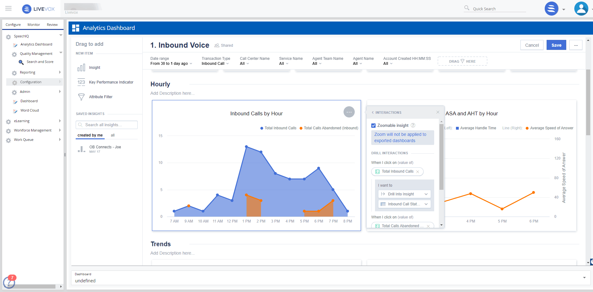
To customize the graphs:
Select the graphs and click the meatballs menu (⋯), to select one of the displayed options.
Select Configuration option to add a title and select filter options.
Select Interactions and choose what must be displayed upon different actions.
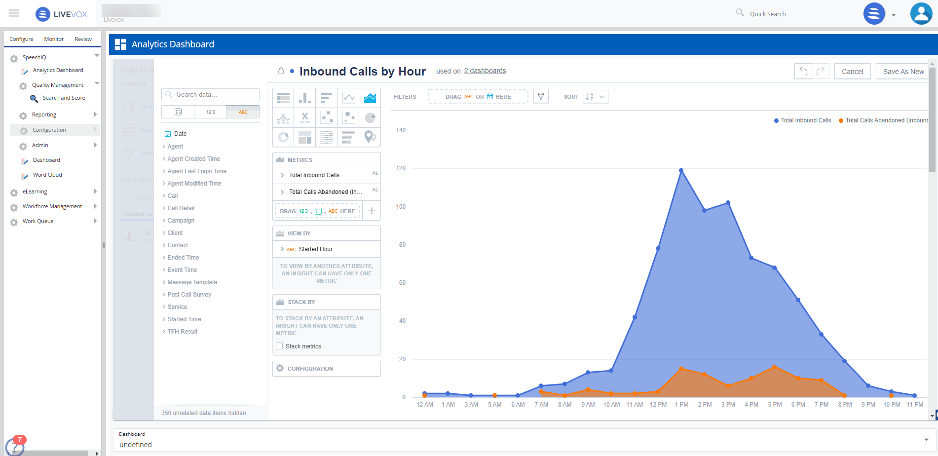
Click Edit to make more elaborate changes.
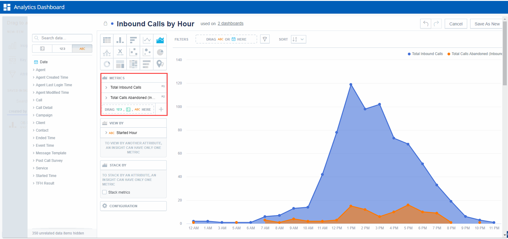
Choose one of the different graph display options to represent the data.
Select the different metrics you want to use for the graph.
Select the View By and Stack By options as necessary.
Select the different filters you want to use to narrow the data. Drag the filter option from the left panel to the Filters panel.